
What data do companies have on me? (Part 1: Spotify)
Published:
Recently I’ve been curious as to the extent to which different companies will track and keep data on me, and also what data they are willing to share with me if I request it. In a series of articles, I’m going to take a look at a few different companies which will be collecting data on me (either for the purposes of recommender systems or for advertising) and what they’ll let me download, and have a look to see what insights about myself and my own behavior I can gain from it. Hopefully I can learn something interesting about both myself, and also a bit more about the way in which different companies will store and process the data they collect on me.
For this first article, I’m going to look at data I was able to obtain about myself from Spotify. Having downloaded a copy of my data, the two main parts of the available data which look like they will be interesting to analyze are:
- My streaming history; this is usually limited to only a year, but I requested my data twice over a five month period, so I have at least 16 months worth of data.
- A file called
Inferences.json. After looking at the descriptions of the data files it appears that this corresponds to some categories Spotify believes I belong to, for the purposes of targeting advertisments (presumably). It should be interesting (and potentially scary) to see how accurate I think they are.
Listening data
Let’s begin by loading the streaming data (which I’ve taken from two separate data requests, one in May 2021, and one in October 2021), merging them together, removing any duplicate entries, and converting the time zones to New York time, rather than UTC.
history_files <- str_subset(list.files(), "StreamingHistory")
history <- as_tibble(map_dfr(history_files, fromJSON)) %>%
  mutate(
    endTime = ymd_hm(endTime, tz = "UTC"),
    endTime = with_tz(endTime, tzone = "America/New_York")
  ) %>%
  filter(
    ymd_hm("2020-06-01 00:00") < endTime,
    endTime < ymd_hm("2021-09-30 23:59")
  ) %>%
  arrange(msPlayed) %>%
  unique()

head(history)
## # A tibble: 6 × 4
##   endTime             artistName          trackName                     msPlayed
##   <dttm>              <chr>               <chr>                            <int>
## 1 2020-10-26 16:15:00 Chris Christodoulou The Raindrop that Fell to th…        0
## 2 2020-10-29 08:29:00 Bear Ghost          Bob Loblaw                           0
## 3 2020-11-17 09:25:00 Bent Knee           Egg Replacer                         0
## 4 2020-11-17 09:25:00 Bent Knee           Lovemenot                            0
## 5 2020-11-17 09:25:00 Bent Knee           Cradle of Rocks                      0
## 6 2020-11-19 16:52:00 Periphery           It's Only Smiles                     0
One interesting thing to see is that songs with zero milliseconds of playtime are recorded - this makes sense for if you are skipping through songs. To process the data to remove these, we’ll remove any songs which were played for less than five seconds. (We’ll also create a variable sPlayed which will be the seconds of the playtime, which is a bit easier to interpret.)
history <- history %>%
  mutate(sPlayed = msPlayed/1000) %>%
  filter(sPlayed > 5) %>%
  select(-msPlayed)
Doing so got rid of around about 2000 entries, which doesn’t seem too large or small of a number of entries to dispose of. With this data, a few questions which seem to be interesting to me are:
- How frequently do I listen to music on Spotify in a day?
- Are there are interesting trends or seasonality in when I listen to music?
- How does my listening vary across different times of day, or during the week as compared to the weekend?
- Can I learn anything about my habits in a given period of time, just from looking at my listening data?
Let’s first take a look at the number of hours I’m listening to music on Spotify from June 2020 to the end of September 2021. As you can see, there is a significant amount of day to day variation, so I’ve also plotted a 14 day moving average (with the error band corresponding to one plus and minus standard deviation over the 14 day period). The y-axis is also plotted on a square root axis to avoid the days where I listened to almost ten hours (!) of music dominating the plot.
time_per_day <- history %>%
  mutate(
    endTime = floor_date(endTime, unit = "day")
  ) %>%
  group_by(endTime) %>%
  summarize(time_per_day = sum(sPlayed)/3600) %>%
  ungroup() %>%
  mutate(
    sPlayed_roll_mean = rollmean(time_per_day, k = 14, na.pad = TRUE),
    sPlayed_roll_sd = rollapply(time_per_day, width = 14, FUN = sd, na.pad = TRUE)
  )

time_per_day %>%
  ggplot(aes(x = endTime, y = time_per_day)) +
  geom_line(alpha = 0.5) + scale_y_sqrt() +
  geom_line(aes(y = sPlayed_roll_mean), colour = "red") +
  geom_ribbon(aes(
    ymin = sPlayed_roll_mean + sPlayed_roll_sd,
    ymax = sPlayed_roll_mean - sPlayed_roll_sd),
    alpha = 0.2, fill = "red", linetype = 0
  ) +
  labs(
    x = "Day",
    y = "Hours per day",
    title = "Hours of listening by day from June 2020 - Sep 2021"
  ) +
  scale_x_datetime(
    "Month",
    date_breaks = "2 months",
    date_labels = "%b %y"
  )
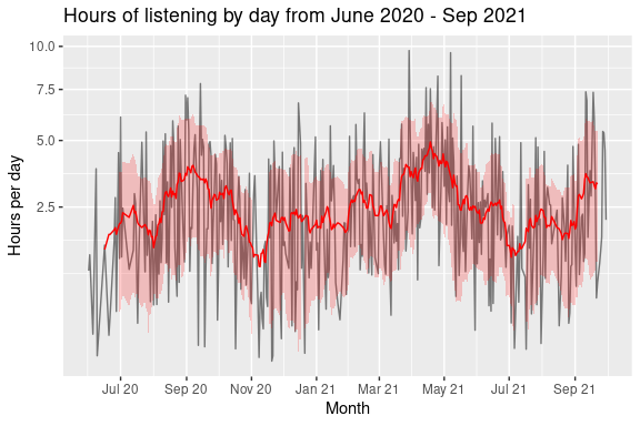
Looking at this, it appears that the peaks occur around April 2021, followed by September 2020. To get a better sense of what is happening on a day to day basis, I’m going to examine the distribution of when I listen to music during the day. To do so, I want to calculate for each hour of every day, the fraction of that hour I am spending listening to music. An approximate way of doing this is to simply sum up the sPlayed variables belonging to hourly bins of the endTime variable, and then convert this to a fraction of an hour.
This is only an approximation - it’s pretty much guaranteed that I’ll have listened to a song near the end of an hour, and have finished listening to it in the next. This isn’t something which is take into account by the calculation I just described. However, as this is going to happen for every hour, it should only marginally underestimate the time in the first hour I am listening to music in a day, and marginally overestimate the time for the last hour I am listening to music, with the intermediate hours having their errors “average out” in some sense.
Let’s do a quick sanity check that we’re getting sensible values for it:
summary_by_hour <- history %>%
  mutate(day_hour = floor_date(endTime, unit = "hour")) %>%
  group_by(day_hour) %>%
  summarize(frac_hour_listening = sum(sPlayed)/(3600))

summary_by_hour %>%
  arrange(desc(frac_hour_listening)) %>%
  head(5)
## # A tibble: 5 × 2
##   day_hour            frac_hour_listening
##   <dttm>                            <dbl>
## 1 2021-07-26 19:00:00                2.92
## 2 2021-09-18 21:00:00                2.69
## 3 2021-06-15 00:00:00                2.28
## 4 2021-05-31 16:00:00                2.22
## 5 2021-07-12 16:00:00                1.97
Taking this literally, this would mean I was somehow able to listen to almost three hours worth of music in an hour - if only I could do this for work! Let’s take a look at the hour in question to see what is going on here.
history %>%
  filter(floor_date(endTime, unit = "hour") ==
           ymd_hms("2021-07-26 19:00:00", tz= "America/New_York"))
## # A tibble: 1 × 4
##   endTime             artistName                        trackName        sPlayed
##   <dttm>              <chr>                             <chr>              <dbl>
## 1 2021-07-26 19:58:00 DEADLOCK: A Pro Wrestling Podcast Nick Gage Makes…  10512.
This makes a lot of sense - I was listening to a podcast for nearly three hours. Due to the way in which the data is coded (where we are given the end times, and the duration for which I was listening to something), if I end up listening to something for over an hour, simply binning the sPlayed by hour won’t correctly give me an hour for each of the three hours. This is just a more extreme version of what would happen if I’m listening to music as it crosses the hour boundary. For now, I’m just going to round any values above one to be set exactly equal to one, rather than handle this explicitly.
With this calculation done, to visualize the data, I’m going to create a plot similar in style to the contribution graphs used on the user pages of GitHub users.
format_hour <- function(hour) {
  mod_hour = hour %% 12
  mod_hour = ifelse(mod_hour == 0, 12, mod_hour)
  am_pm = ifelse((hour/12) >= 1, "PM", "AM")
  return(paste(mod_hour, am_pm))
}

summary_by_hour_complete <- summary_by_hour %>%
  complete(
    day_hour = seq(min(day_hour), max(day_hour), by="hour")
  ) %>%
  mutate(
    day = floor_date(day_hour, unit = "day"),
    hour = hour(day_hour),
    month = fct_inorder(format(day_hour, "%b %Y"))
  )

summary_by_hour_complete %>%
  ggplot(aes(x = day, y = hour)) +
  facet_wrap(~ month, scales = "free_x") +
  geom_tile(aes(fill = frac_hour_listening), colour = "white") +
  scale_fill_viridis_c(
    name = "Fraction of hour\nlistening to music",
    option = "D", # Variable color palette
    direction = -1, # Variable color direction
    na.value = "grey90",
    limits = c(0, 1)
  ) +
  scale_y_continuous(
    breaks = c(2, 6, 10, 14, 18, 22),
    labels = format_hour
  ) +
  theme(
    panel.background = element_blank(),
    legend.position = "bottom",
    legend.text = element_blank()
  ) +
  labs(
    x = "Day of the week",
    y = "Hour of the day",
    title = "Proportion of hours of day listening to music/podcasts on Spotify",
    fill = "Fraction of hour listening"
  )
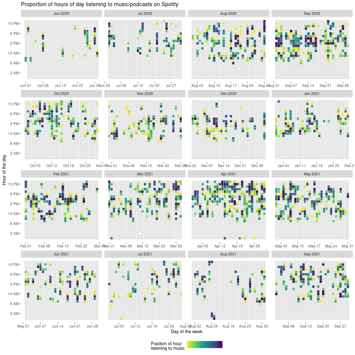
From this plot, there are a few things I can identify:
- There were some periods of time where I was presumably working very late (from March to mid April 2021);
- In June and July in 2020, I barely listened to anything (I guess I spent all day watching press conferences about COVID or something);
- Similarly, for about two weeks in August 2021, I pretty much listened to nothing (which I almost find hard to believe).
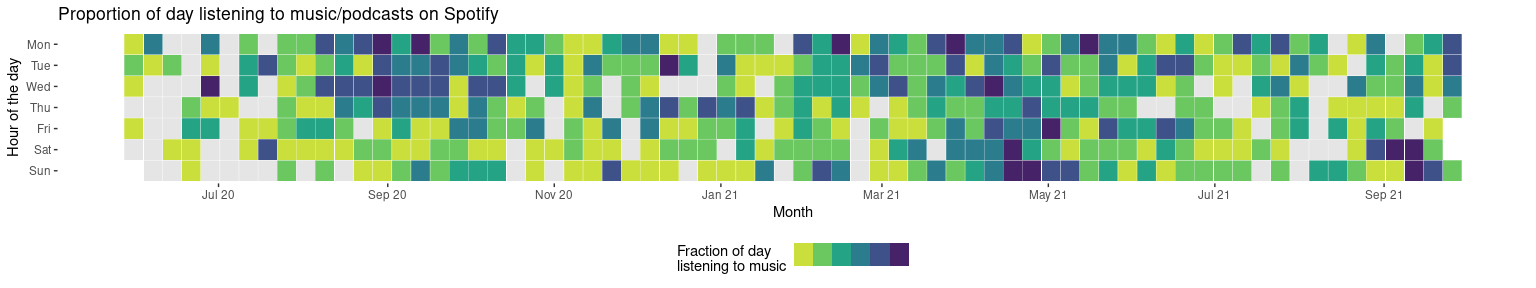
One thing which is hard to identify from this plot is whether there is a change in my listening habits depending on whether it is during the week or on the weekend. To investigate this, I’ll create plots
- highlighting the proportion of the day (from Monday to Sunday) against a particular week; and
- highlighting the average and standard deviation proportion of each hour in a day I’m listening to music, against the particular day of the week
summary_by_day <- history %>%
  mutate(day_hour = floor_date(endTime, unit = "day")) %>%
  group_by(day_hour) %>%
  summarize(frac_day_listening = min(1, sum(sPlayed)/(3600*24))) %>%
  complete(
    day_hour = seq(min(day_hour), max(day_hour), by="day")
  ) %>%
  mutate(
    day = wday(floor_date(day_hour, unit = "day"), label = TRUE, week_start = 1),
    week = floor_date(day_hour, unit = "week")
  )

summary_by_day %>%
  ggplot(aes(
    y = fct_rev(day),
    x = week)
  ) +
  geom_tile(aes(fill = frac_day_listening), colour = "white") +
  scale_fill_viridis_b(
    breaks = c(0, 0.05, 0.1, 0.15, 0.2, 0.25, 0.3),
    name = "Fraction of day\nlistening to music",
    option = "D", # Variable color palette
    direction = -1, # Variable color direction
    na.value = "grey90",
    limits = c(0, 0.3)
  ) +
  theme(
    panel.background = element_blank(),
    legend.position = "bottom",
    legend.text = element_blank()
  ) +
  labs(
    x = "Day of the week",
    y = "Hour of the day",
    title = "Proportion of day listening to music/podcasts on Spotify"
  ) +
  scale_x_datetime(
    "Month",
    date_breaks = "2 months",
    date_labels = "%b %y"
  )
average_hours_across_days <- history %>%
  mutate(day_hour = floor_date(endTime, unit = "hour")) %>%
  complete(
    day_hour = seq(min(day_hour), max(day_hour), by="hour")
  ) %>%
  mutate(
    sPlayed = replace_na(sPlayed, 0)
  ) %>%
  mutate(
    day = wday(floor_date(day_hour, unit = "day"), label = TRUE, week_start = 1),
    hour = hour(day_hour)
  ) %>%
  group_by(day, hour) %>%
  summarize(
    avg_prop = min(1, mean(sPlayed)/3600),
    sd_prop = sd(sPlayed/3600)
  )

average_hours_across_days %>%
  ggplot(aes(x = hour, y = fct_rev(day))) +
  geom_tile(aes(fill = avg_prop), colour = "white") +
  scale_fill_viridis_c(
    name = "Fraction of hour on\navg. listening to music",
    option = "D", # Variable color palette
    direction = -1, # Variable color direction
    na.value = "grey90",
    limits = c(0, max(average_hours_across_days$avg_prop))
  ) +
  theme(
    panel.background = element_blank(),
    legend.position = "none",
    legend.text = element_blank()
  ) +
  scale_x_continuous(
    breaks = c(2, 6, 10, 14, 18, 22),
    labels = format_hour
  ) +
  labs(
    x = "Time of the day",
    y = "Day of the week",
    title = "Proportion of day listening to music on average"
  ) +
  coord_equal()
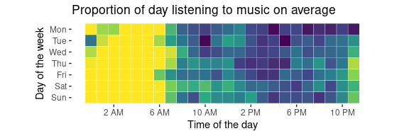
average_hours_across_days %>%
  ggplot(aes(x = hour, y = fct_rev(day))) +
  geom_tile(aes(fill = sd_prop), colour = "white") +
  scale_fill_viridis_c(
    name = "Standard deviation\nof proportions",
    option = "D", # Variable color palette
    direction = -1, # Variable color direction
    na.value = "grey90",
    limits = c(0, max(average_hours_across_days$sd_prop))
  ) +
  theme(
    panel.background = element_blank(),
    legend.position = "none",
    legend.text = element_blank()
  ) +
  scale_x_continuous(
    breaks = c(2, 6, 10, 14, 18, 22),
    labels = format_hour
  ) +
  labs(
    x = "Time of the day",
    y = "Day of the week",
    title = "Standard deviation of proportion of day listening to music"
  ) +
  coord_equal()
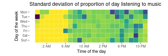
So, from these plots there are a few interesting observations I can make:
- From these plots, you can pretty much infer what my sleep patterns are; I’m up by around 7am, and go to bed usually around 11pm or 12am.
- I tend to stay up past midnight only on Monday and Tuesdays, but I also don’t do so very frequently (as the standard deviation is high for these days and time regions).
- I tend to listen to music more during the week than not during the week.
So far, this is telling me a lot about me, but not a lot about my music listening. Let’s quickly see who I’ve listened to the most:
history %>%
  group_by(artistName) %>%
  summarize(total_minutes = sum(sPlayed)/60) %>%
  ungroup() %>%
  arrange(desc(total_minutes)) %>%
  head(5)
## # A tibble: 5 × 2
##   artistName                        total_minutes
##   <chr>                                     <dbl>
## 1 Bear Ghost                                7983.
## 2 Closure in Moscow                         4860.
## 3 Ayreon                                    3462.
## 4 Leprous                                   3186.
## 5 DEADLOCK: A Pro Wrestling Podcast         3157.
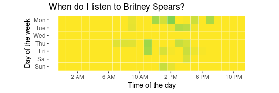
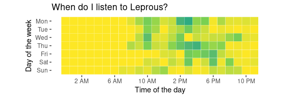
(To save you a Google, the top four are all are all progressive metal-type-y bands.) What is more interesting to me is to understand when I tend to listen to different types of music. Modifying the code from earlier, I can very quickly see when I tend to listen to some Britney Spears:
plot_artist <- function(artist) {
  history %>%
  filter(artistName == artist) %>%
  mutate(day_hour = floor_date(endTime, unit = "hour")) %>%
  complete(
    day_hour = seq(min(day_hour), max(day_hour), by="hour")
  ) %>%
  mutate(
    sPlayed = replace_na(sPlayed, 0),
    day = wday(floor_date(day_hour, unit = "day"), label = TRUE, week_start = 1),
    hour = hour(day_hour)
  ) %>%
  group_by(day, hour) %>%
  summarize(
    avg_prop = min(1, mean(sPlayed)/3600),
    sd_prop = sd(sPlayed/3600)
  ) %>%
  ggplot(aes(x = hour, y = fct_rev(day))) +
  geom_tile(aes(fill = avg_prop), colour = "white") +
  scale_fill_viridis_c(
    name = "Fraction of hour on\navg. listening to music",
    option = "D", # Variable color palette
    direction = -1, # Variable color direction
    na.value = "grey90",
    limits = c(0, max(average_hours_across_days$avg_prop))
  ) +
  theme(
    panel.background = element_blank(),
    legend.position = "none",
    legend.text = element_blank()
  ) +
  labs(
    x = "Time of the day",
    y = "Day of the week",
    title = sprintf("When do I listen to %s?", artist)
  ) +
  coord_equal() +
  scale_x_continuous(
    breaks = c(2, 6, 10, 14, 18, 22),
    labels = format_hour
  )
}

plot_artist("Britney Spears")
…as compared when I listen to Leprous:
plot_artist("Leprous")
One last question I have is, given a particular day and time of the week, who would I have most likely been listening to? I suspect the actual distribution is relatively flat, but I think it’s more fun to see what would be the “peak” of these distributions. Let’s have a look and see for what days and hours within the week where the most likely artist is Britney Spears:
artist_by_hour_day <- history %>%
  mutate(endTime = floor_date(endTime, unit = "hour")) %>%
  complete(
    endTime = seq(min(endTime), max(endTime), by="hour")
  ) %>%
  mutate(
    sPlayed = replace_na(sPlayed, 0),
    day = wday(floor_date(endTime, unit = "day"), label = TRUE, week_start = 1),
    hour = hour(endTime)
  ) %>%
  group_by(artistName, day, hour) %>%
  summarize(
    total = n()
  ) %>% drop_na() %>%
  ungroup() %>% group_by(day, hour) %>%
  filter(total == max(total)) %>% ungroup()

artist_by_hour_day %>%
  filter(artistName == "Britney Spears") %>%
  select(day, hour)
## # A tibble: 1 × 2
##   day    hour
##   <ord> <int>
## 1 Thu       7
So, I guess if I’m listening to music on 7am on a Thursday, I’m most likely listening to Britney Spears - interesting to know!
Advertising inferences
Before talking about the data, here is Spotify’s description about the data:
We draw certain inferences about your interests and preferences based on your usage of the Spotify service and using data obtained from our advertisers and other advertising partners. This includes a list of market segments with which you are currently associated. Depending on your settings, this data may be used to serve interest-based advertising to you within the Spotify service.
With that in mind, let’s load it up and take a look:
inferences <- fromJSON("Inferences.json")[["inferences"]]
head(inferences)
## [1] "1P_Custom_Discovery_Streamers"
## [2] "1P_Custom_Google_Pixel"
## [3] "1P_Custom_Google_Streamers"
## [4] "2P_AT&T_ATTP_Core_Audiences_11Jun2020_US"
## [5] "2P_Comcast_All Subscribers_11Jul2019_US"
## [6] "2P_HBO_GO Subscribers_12March2020_US [Do Not Use in 2021]"
For the advertising inferences data, two questions come immediately to mind:
- In what way does Spotify try and target advertising towards me? What types of groups does it try and identify me as?
- How good of a job does it do, in my view?
Looking at the length of the vector, there appear to be 676 different advertising groupings Spotify appears to think I’m apart of. Taking a quick scroll through, some interesting things stick out.
Country identifiers
The first thing which struck me are the country identifiers attached to some of the strings:
inferences[grep("Alcohol Consumers", inferences)]
## [1] "3P_Alcohol Consumers_CA" "3P_Alcohol Consumers_ES"
## [3] "3P_Alcohol Consumers_FR" "3P_Alcohol Consumers_IT"
## [5] "3P_Alcohol Consumers_UK" "3P_Alcohol Consumers_US"
To be generous to Spotify, it got two out of the six countries correct - I am originally from the UK, and I am currently in the US. I don’t use a VPN, so I’m not sure how it’s also wanted to identify me as identifying in some way as being (I’m guessing here) Canadian, Spanish, French or Italian? To get an idea to which countries I am frequently “associated” with (according to Spotify), I’ll count the number with each country label.
edit_string <- function(str) {
  # Split by underscore
  str1 <- str_split(str, "_")[[1]]
  str1 <- str1[2:length(str1)]

  # Extract what is after the last underscore
  poss_cc <- str1[length(str1)]

  # Formatting the string
  if (nchar(poss_cc) > 2) {
    if (grepl("\\[", poss_cc)) {
      no_use <- TRUE
      country_code <- substr(poss_cc, 1, 2)
      str1 <- str1[1:length(str1)-1]
    } else {
      country_code <- NA
      no_use <- FALSE
    }
  } else {
    country_code <- poss_cc
    str1 <- str1[1:length(str1)-1]
    no_use <- FALSE
  }

  return(tibble(
    value = paste(str1, collapse = "_"),
    country_code = country_code,
    no_use = no_use
  ))
}

inference_strs <- map_dfr(inferences[1:658], edit_string)

inference_strs %>%
  group_by(country_code) %>%
  summarize(count = n()) %>%
  arrange(desc(count)) %>%
  head(5)
## # A tibble: 5 × 2
##   country_code count
##   <chr>        <int>
## 1 US             202
## 2 UK             118
## 3 FR              68
## 4 IT              67
## 5 DE              61
Looking at the aggregate numbers, it’s good to see that the US is the most frequent country mentioned (as I’ve been here for five years), followed by the UK (as it’s where I lived beforehand). I’m still somewhat surprised by the frequency of the other countries; if I simply total up the other countries, they still make up about half of the observations:
inference_strs %>%
  mutate(
    country_code = ifelse(
      country_code %in% c("US", "UK") | is.na(country_code),
      country_code,
      "not_US_or_UK"
  )) %>%
  group_by(country_code) %>%
  summarize(count = n()) %>%
  arrange(desc(count))
## # A tibble: 4 × 2
##   country_code count
##   <chr>        <int>
## 1 not_US_or_UK   326
## 2 US             202
## 3 UK             118
## 4 <NA>            12
I’m really curious how this comes about, as they should be able to infer my location and nationality pretty easily.
[Do not use in 2021] tags
One interesting thing which I came across is that there are several tags with labels of [Do not use in 2021] or something similar. Let’s take a look at some of these:
inference_strs %>% filter(no_use == TRUE) %>% head(6)
## # A tibble: 6 × 3
##   value                                                      country_code no_use
##   <chr>                                                      <chr>        <lgl>
## 1 HBO_GO Subscribers_12March2020                             US           TRUE
## 2 Starbucks_All Starbucks Rewards_Lapsed and Active_23Sept2… US           TRUE
## 3 Starbucks_Pushspring_Starbucks_Holiday Retail_Competitive… US           TRUE
## 4 Black Friday Shoppers                                      US           TRUE
## 5 Black Friday and Cyber Monday Shoppers                     US           TRUE
## 6 Breakfast and Brunch Enthusiasts                           US           TRUE
I find it interesting that they’re labelled as being told to “Do not use in 2021”; I’m not sure if there’s something specific about 2021, or whether this is just because particular deals with particular companies have expired at this time, and so are labelled as to not use in the current year. Maybe next year I’ll re-download the data and see if anything has changed?
How correct are they?
Overall, I’m interested in how correct I would say they are in their assessment of what I am like (for what they could try and sell to advertisers). Removing the country codes, this still leaves under just about 400 records to go through, which is just about doable by hand. To assess how well they’ve done, I’ll assign each label a score of one if I think it is reasonably correct, zero if not, and ignore a label if I feel like it is a duplicate of another.
Rather than discuss every single record, I’ll discuss a few ones I found to be particularly interesting, and then talk about the overall accuracy:
- “Climbing Enthusiasts” - I mention this as this was one of the few relatively niche areas I found that they correctly mentioned. I’m also curious how they figured it out, as I haven’t listened to any climbing podcasts (such as Alex Hannold’s podcast, for example).
- “Custom_FedEx_Stay at Home Travelers_19Oct2020” - I highlight this only as I enjoy the oxymoron of both staying at home and travelling. Does switching to the couch from my bed count?
- “Custom_Marketing Employees”, “Distribution & Logistics Employees”, “Government Workers”, “Healthcare Professionals”, “Law and Accounting Profession”, “Legal Services Workers”, “Manufacturing Employees”, “Sales & Marketing Professionals”, “Transport Workers”, “Utilities Workers” - Pretty frequently when going through the list, I felt like there were either a lot of ‘high probability’ labels, or making a lot of guesses like this (all of which are incorrect).
- “Engaged/Getting Married”, “Getting Divorced” - On one hand, I find this amusing in how incorrect is is (and presumably how drama filled my life must be to be getting divorced and married within the same window of time). On the other hand, I’m concerned that a company is trying to make predictions about being divorced for presumably the purposes of targeted advertising; it comes off as a bit slimy and unethical to me.
Overall, my self-rated accuracy of the advertising labels was just under 30%. On it’s own, it’s hard to contextualize this, as:
- I don’t have any context for other people and how accurate they think their profiles are;
- It’s unclear to me whether self-reported accuracy is actually important for the purposes of trying to serve advertisements;
- Maybe 30% is a really good score in general? Maybe it’s also really good for someone who goes out of their way to stop themselves from being tracked by companies.
The main question I’m left with is wondering about how companies come up with these type of predictions. I can imagine that there must be some type of data collection going on in the background (for instance, from my listening activity, possibly from buying data from other companies and trying to identify me or people like myself in that data), but it’s hard for me to think about what process is went through in order to validate this data, or the predicted attributes about myself used for the purposes of advertising.
Conclusion
All in all, it was interesting to have a look at my own listening data, and then slightly worrying to look at the different advertising profiles. I was glad that it wasn’t too accurate though. In terms of doing the visualizations, it was pretty fun creating them (although some of the date handling was painful). As I look at the different datasets I can get about myself from different companies, I’ll start comparing them, and also try and merge them together to learn some interesting things about myself.