ACS and satellite data on Atlanta and the wider metropoliton area
1 Geographic units and time period(s) considered
Throughout, we will consider different geographic units, corresponding to various collections of counties, and other unified geographical areas corresponding to different parts of the landscape.
core_counties <- c(
    "Fulton", "DeKalb", "Gwinnett", "Cobb", "Clayton"
)

arc_counties <- c(
    "Fulton", "DeKalb", "Gwinnett", "Cobb", "Clayton", "Forsyth",
    "Cherokee", "Douglas", "Fayette", "Henry", "Rockdale"
)

atlanta_msa_1 <- c(
    'Fulton', 'Gwinnett',
    'Cobb', 'DeKalb', 'Clayton',
    'Cherokee', 'Forsyth',
    'Henry', 'Paulding', 'Coweta',
    'Douglas', 'Fayette', 'Carroll',
    'Newton', 'Bartow', 'Walton',
    'Rockdale'
)

atlanta_msa_2 <- c(
    'Barrow', 'Spalding', 'Pickens',
    'Haralson', 'Dawson', 'Butts',
    'Meriwether', 'Morgan',
    'Pike', 'Lamar', 'Jasper', 'Heard'
)

atlanta_msa <- c(atlanta_msa_1, atlanta_msa_2)
Throughout, we will frequently use ACS data; for ACS 1 year estimates, we use data from 2009 to 2019 (we note that 2020 data has not been released as a result of the COVID pandemic adversely affecting data collection), and for ACS 5 year estimates, we use data in the range from the 2006-to-2010 estimates to the 2016-to-2020.
years_acs1 <- lst(
    2009, 2010, 2011, 2012, 2013, 2014,
    2015, 2016, 2017, 2018, 2019
)

years_acs5 <- lst(
    2010, 2011, 2012, 2013, 2014,
    2015, 2016, 2017, 2018, 2019, 2020
)
1.1 Defining inside and outside the perimeter
Here, we will consider the I-285 ringroad as defining the “perimeter” of the “main” part of Atlanta, and will consider anything inside of this as being “inside the perimeter” (or ITP), and anything outside as “outside the perimeter” (or OTP). The shape file for the ringroad is available online.
highways <- sf::st_read("../data/georgia-highways.geojson")## Reading layer `Expressways_Georgia' from data source `/mnt/c/Users/adavi/Documents/comp-journal/ajc-satellite/data/georgia-highways.geojson' using driver `GeoJSON'
## Simple feature collection with 44 features and 10 fields
## Geometry type: MULTILINESTRING
## Dimension: XY
## Bounding box: xmin: -85.55382 ymin: 30.62627 xmax: -81.09842 ymax: 34.98588
## Geodetic CRS: WGS 84it_285 <- highways %>%
filter(str_detect(ROAD_NAME, "285")) %>%
select(ROAD_NAME, geometry)
it_285 <- it_285[c(1, 3), ]
itp <- st_union(st_convex_hull(it_285))As is visible from the plot below, the ringroad does not necessarily line up nicely with the county divisions within Georgia: the perimeter is highlighted in red, with the regular counties highlighted in black. However, the census tracts (in grey) do line up more nicely with the perimeter, albeit not exactly.
arc_counties_shp <- sf::st_read("../ga-counties/Counties_Georgia.shp") %>%
    filter(NAME10 %in% arc_counties) %>%
    select(NAME10, COUNTYFP10, geometry)
## Reading layer `Counties_Georgia' from data source `/mnt/c/Users/adavi/Documents/comp-journal/ajc-satellite/ga-counties/Counties_Georgia.shp' using driver `ESRI Shapefile'
## Simple feature collection with 159 features and 20 fields
## Geometry type: MULTIPOLYGON
## Dimension: XY
## Bounding box: xmin: -85.60517 ymin: 30.35576 xmax: -80.75143 ymax: 35.00067
## Geodetic CRS: WGS 84arc_tracts_shp <- sf::st_read("../ga-tracts-2019/tl_2019_13_tract.shp") %>%
filter(COUNTYFP %in% arc_counties_shp$COUNTYFP10)## Reading layer `tl_2019_13_tract' from data source `/mnt/c/Users/adavi/Documents/comp-journal/ajc-satellite/ga-tracts-2019/tl_2019_13_tract.shp' using driver `ESRI Shapefile'
## Simple feature collection with 1969 features and 12 fields
## Geometry type: MULTIPOLYGON
## Dimension: XY
## Bounding box: xmin: -85.60516 ymin: 30.35576 xmax: -80.78296 ymax: 35.0013
## Geodetic CRS: NAD83highway_arc <- st_intersection(highways, arc_counties_shp)
atlanta_msa_shp <- sf::st_read("../ga-counties/Counties_Georgia.shp") %>%
filter(NAME10 %in% atlanta_msa) %>%
select(NAME10, COUNTYFP10, geometry)## Reading layer `Counties_Georgia' from data source `/mnt/c/Users/adavi/Documents/comp-journal/ajc-satellite/ga-counties/Counties_Georgia.shp' using driver `ESRI Shapefile'
## Simple feature collection with 159 features and 20 fields
## Geometry type: MULTIPOLYGON
## Dimension: XY
## Bounding box: xmin: -85.60517 ymin: 30.35576 xmax: -80.75143 ymax: 35.00067
## Geodetic CRS: WGS 84sf_use_s2(FALSE)
highway_arc_msa <- st_intersection(
highways, sf::st_buffer(atlanta_msa_shp, dist = 0)
)
ggplot() +
geom_sf(data = arc_tracts_shp, colour = "grey", fill = NA) +
geom_sf(data = arc_counties_shp, colour = "black", fill = NA) +
geom_sf(data = itp, colour = "red", fill = NA)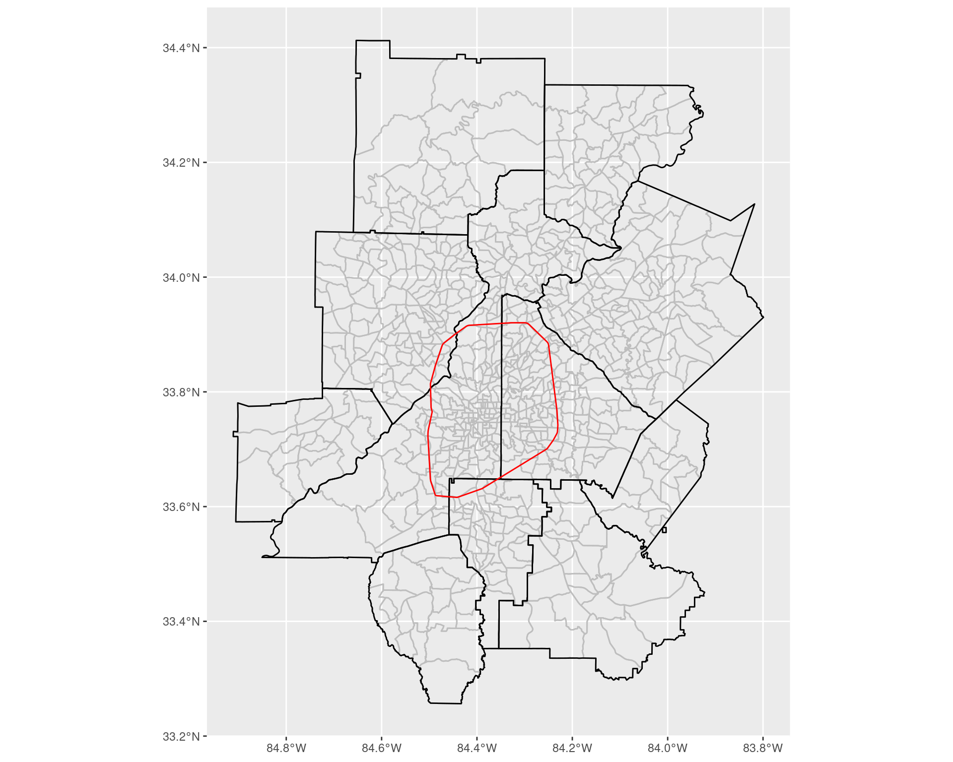
Ultimately, we want to try and assign each census tract to being ITP or OTP. Firstly, to handle this, we count the number of tracts (where we use the 2020 Census Tracts) which intersect with the “perimeter” itself.
ics <- st_intersects(
    st_transform(st_boundary(itp), crs = 4269),
    arc_tracts_shp
)

print(paste(
    "Number of census tracts intersecting the interstate:",
    length(ics[[1]])
))
## [1] "Number of census tracts intersecting the interstate: 57"As we can see, a small but non-zero number fall inside of this category; we will count these tracts as being inside of the perimeter.
arc_tracts_shp <- arc_tracts_shp %>%
    select(NAME, COUNTYFP, TRACTCE, geometry) %>%
    mutate(
        tp = st_intersects(
            st_transform(st_boundary(itp), crs = 4269),
            geometry, sparse = FALSE
        )[1, ],
        itp = st_within(
            geometry,
            st_transform(itp, crs = 4269), sparse = FALSE
        )[, 1],
        itp = tp | itp,
        otp = !itp
    ) %>% select(-tp)

arc_tracts_shp %>%
    st_drop_geometry() %>%
    summarize(
        itp = sum(itp), otp = sum(otp)
    )
arc_tracts_shp2 <- arc_tracts_shp %>%
pivot_longer(
cols = c(itp, otp),
names_to = "class",
values_to = "in_class"
) %>%
filter(in_class == TRUE) %>%
select(-in_class)
ggplot() +
geom_sf(
data = arc_tracts_shp2, colour = "grey",
mapping = aes(fill = class)
) +
geom_sf(data = arc_counties_shp, colour = "black", fill = NA) +
geom_sf(data = itp, colour = "red", fill = NA) +
coord_sf(xlim = c(-84.6, -84), ylim = c(33.4, 34), expand = TRUE)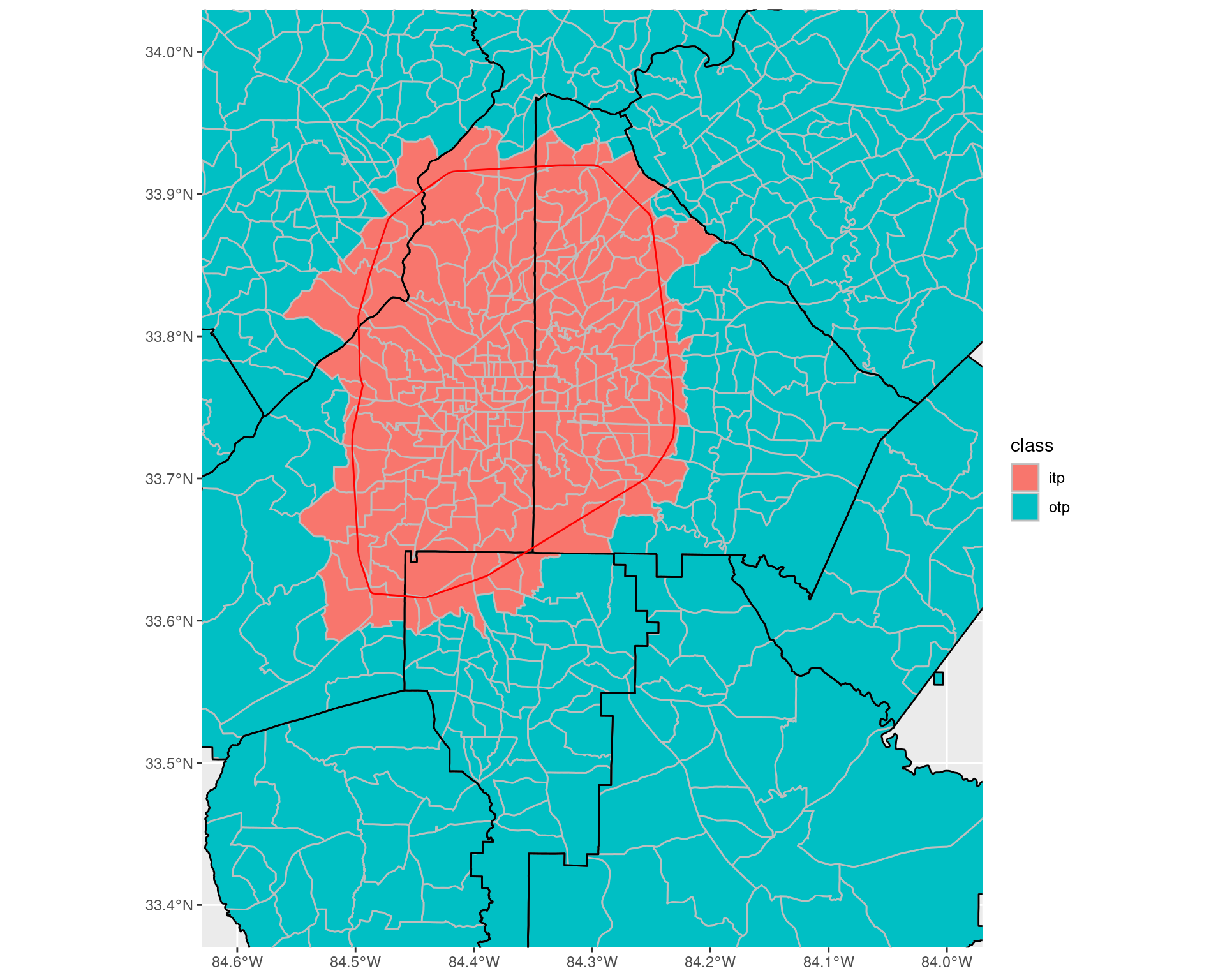
2 Household income distribution in the Atlanta metro area between 2009 and 2019
ACS 1-year data from 2009 to 2019, showing the number of households (with error estimates) which lie in particular income bands across the ARC counties.
df_income_distributionwrite_csv(
df_income_distribution,
"data-files/income_distribution_by_year_county.csv"
)2.1 How has the income distribution changed over the years across the Atlanta area?
To answer this, we summarize over all the counties the number of households in each income bracket, along with the total number, and do so for each year. The margin of errors give 90% confidence intervals of each estimate; to get the margin of error for a sum of variables, we sum the square of the margin of error across all the variables, and then take the square root. For this analysis, we look at all the counties which belong to the Altanta Regional Commission.
2.1.1 Looking at number of households
From the plots below, we can see that the majority of the shift in the income distribution has been a large increase in the number of households earning between $150,000 and $199,999 and more than $200,000 (by almost 100,000 from 2009 to 2019 in both groups), with a similar drop of almost 100,000 households earning less than $50,000.
df_income_dist_summary <- df_income_distribution %>%
    select(year, county, variable, estimate, moe) %>%
    group_by(year, variable) %>%
    summarize(
        estimate = sum(estimate),
        moe = sqrt(sum(moe**2))
    ) %>%
    ungroup() %>%
    mutate(
        variable = factor(variable, ordered = TRUE,
        levels = income_var_labels)
    ) %>%
    filter(variable != "Total")

df_income_dist_summarywrite_csv(
df_income_dist_summary,
"data-files/income_distribution_by_year.csv"
)
require(scales)
ggplot(df_income_dist_summary, aes(x = variable, y = estimate)) +
facet_wrap(~ year) +
geom_col() +
geom_errorbar(aes(ymin = estimate - moe, ymax = estimate + moe)) +
labs(
x = "Income band", y = "Number of households",
title = "Distribution of Household Income in the Atlanta area Between 2009 and 2019"
) + scale_y_continuous(labels = comma) +
coord_flip()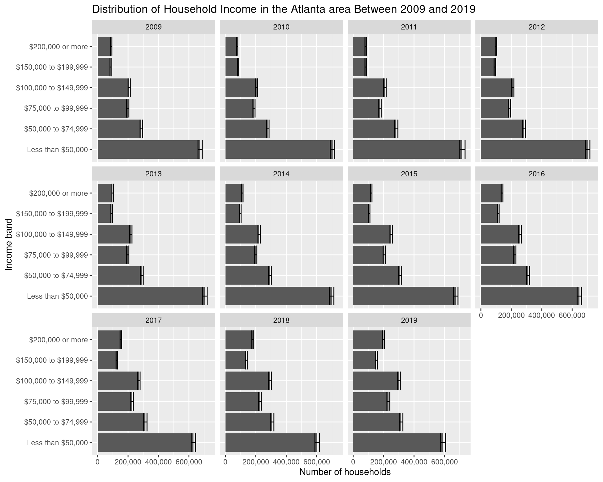
df_income_dist_summary %>%
    mutate(year = as.Date(paste(year, 1, 1, sep = "-"))) %>%
    ggplot(aes(
        x = year, y = estimate, col = variable, fill = variable,
        ymin = estimate - moe, ymax = estimate + moe)
    ) + geom_point(show.legend = FALSE) + geom_line() +
    geom_ribbon(alpha = 0.2, show.legend = FALSE) +
    labs(
        x = "Year", y = "Number of households",
        col = "Income band"
    ) +
    theme(legend.position = "bottom")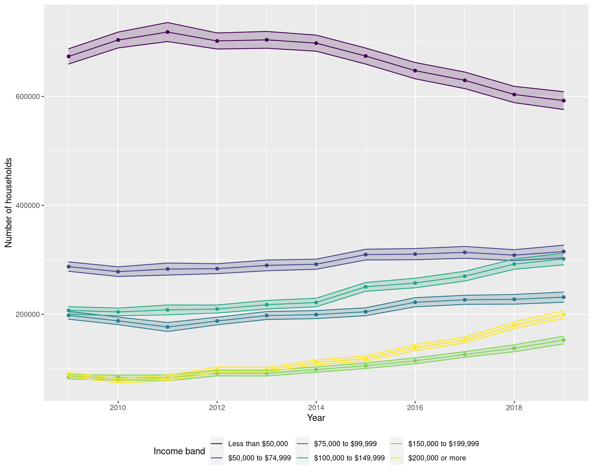
2.1.2 Looking at the proportion of households
df_income_prop_summary <- df_income_distribution %>%
    select(year, county, variable, estimate, moe) %>%
    group_by(year, variable) %>%
    summarize(
        estimate = sum(estimate),
        moe = sqrt(sum(moe**2))
    ) %>%
    ungroup() %>%
    mutate(
        variable = factor(variable, ordered = TRUE, levels = income_var_labels)
    ) %>%
    filter(variable != "Total") %>%
    group_by(year) %>%
    mutate(
        moe = moe / sum(estimate),
        estimate = estimate / sum(estimate),
    )

df_income_prop_summaryggplot(df_income_prop_summary, aes(x = variable, y = estimate)) +
facet_wrap(~ year) +
geom_col() +
geom_errorbar(aes(ymin = estimate - moe, ymax = estimate + moe)) +
labs(
x = "Income band", y = "Proportion of households",
title = "Distribution of Household Income in the Atlanta area Between 2009 and 2019"
) + scale_y_continuous(labels = comma) + coord_flip()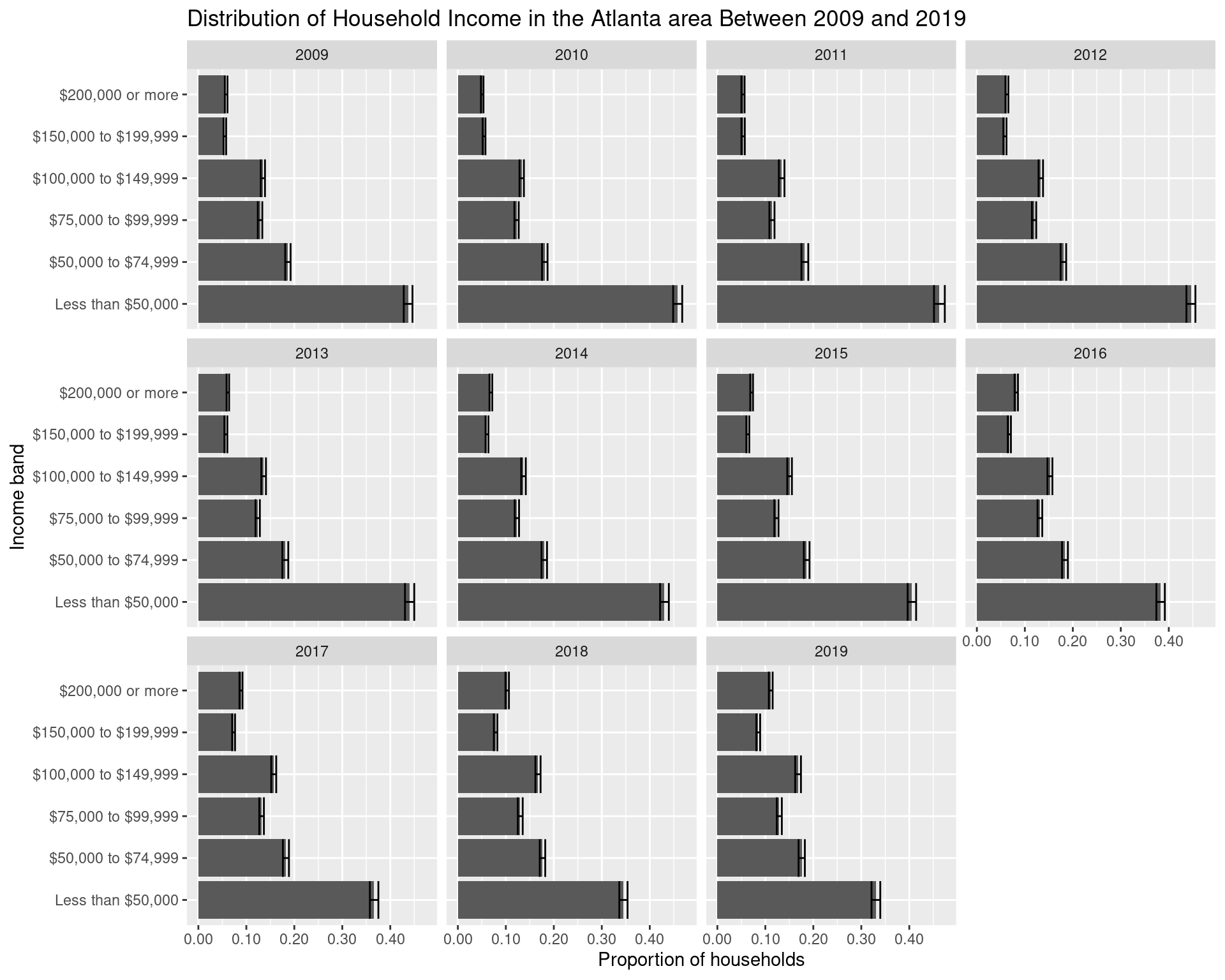
2.1.3 Overall change between 2009 and 2019
Here we focus particularly on the change between the years in 2009 and 2019.
cbPalette <- c("#E69F00", "#56B4E9", "#009E73", "#F0E442", "#0072B2", "#D55E00", "#CC79A7")

df_income_dist_summary %>%
    filter(year %in% c(2009, 2019)) %>%
    mutate(year = factor(year)) %>%
    ggplot(aes(x = variable, y = estimate, fill = year)) +
    geom_col(position = "dodge") +
    geom_errorbar(
        aes(ymin = estimate - moe, ymax = estimate + moe),
        position = "dodge"
    ) + scale_fill_manual(values = cbPalette) +
    geom_text(
        aes(label = year, y = 10000),
        position = position_dodge(width = 1),
        size = 5, hjust = 'left',
        col = "white"
    ) +
    labs(
        y = "Number of households", x = "Income band",
        title = "Distribution of Household Income in the Atlanta area (2009 and 2019)", fill = "Year",
        subtitle = "Data from the 1-year ACS from 2009 and 2019"
    ) + scale_y_continuous(labels = comma) +
    coord_flip() + theme(legend.position = "none")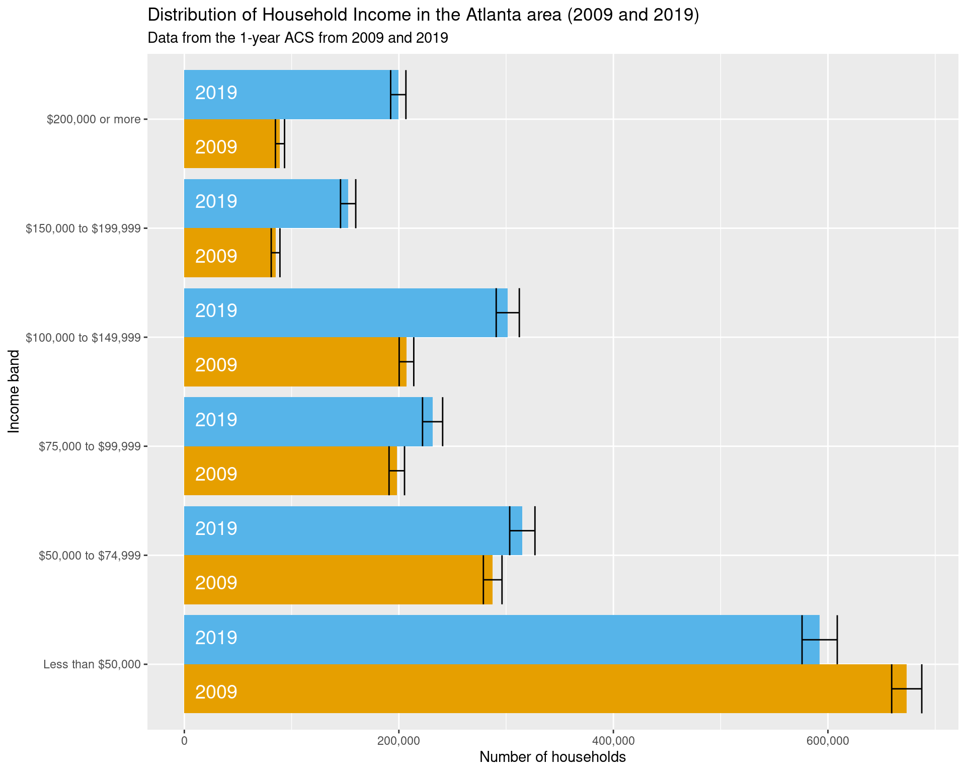
ggsave("img-files/income_distribution_by_year.pdf")2.1.4 Looking at the changes in each county
df_income_distribution %>%
    select(year, county, variable, estimate, moe) %>%
    filter(variable != "Total") %>%
    mutate(
        variable = factor(variable, ordered = TRUE, levels = income_var_labels)
    ) %>%
    ggplot(aes(x = year, y = estimate, fill = forcats::fct_rev(variable))) +
    facet_wrap(~ county, scales = "free") +
    geom_col() + coord_flip() +
    labs(
        x = "Year", y = "Number of Households", fill = "Income Band",
        title = "Distribution of Household Income across Counties and Year",
        subtitle = "Data from the 1-year ACS from 2009 to 2019"
    ) +
    theme(legend.position = "bottom")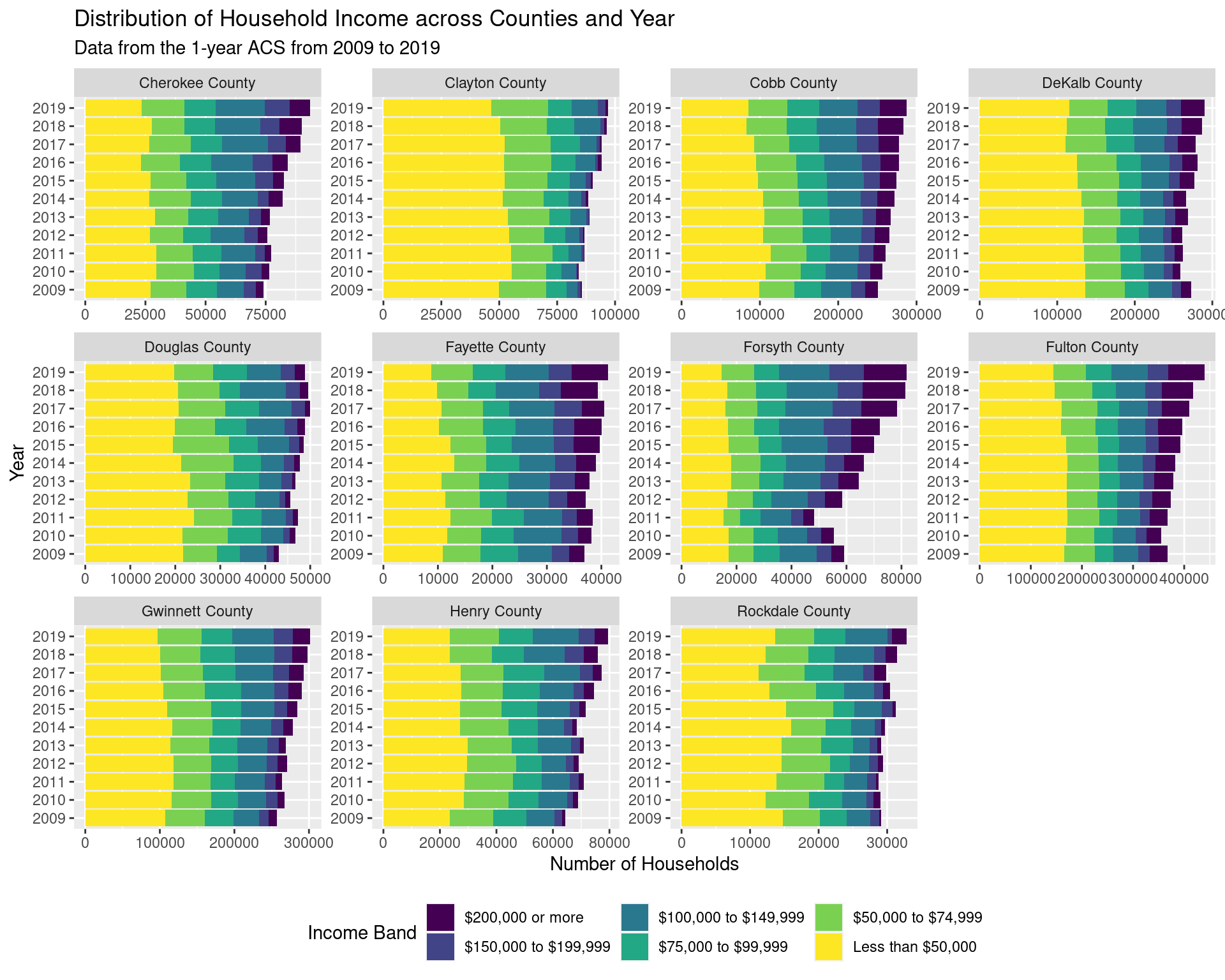
2.2 How has the income distribution changed ITP and OTP from 2009 to 2019?
From the plot below, we can see that the number of households inside of the perimeter earning less than $50,000 has decreased by approximately 25000, whereas that outside the perimeter has stayed roughly constant.
df_income_tracts <- map_dfr(
    lst(2009, 2019),
    ~ get_acs(
        geography = "tract",
        state = "GA",
        variables = income_var_list,
        year = .x,
        county = arc_counties,
        survey = "acs5",
        geometry = FALSE
    ),
    .id = "year") %>%
    mutate(
        tract = gsub("^(.*?),.*", "\\1", NAME),
        county = gsub("^(.*?), (.*?),.*", "\\2", NAME)
    ) %>%
    select(-NAME) %>%
    relocate(tract, county, .after = GEOID)

df_tracts <- map_dfr(
    lst(2009, 2019),
    ~ get_acs(
        geography = "tract",
        state = "GA",
        variables = "B19001_001",
        year = .x,
        county = arc_counties,
        survey = "acs5",
        geometry = TRUE
    ),
    .id = "year") %>%
    select(year, GEOID, geometry) %>%
    mutate(
        tp = st_intersects(
            st_transform(st_boundary(itp), crs = 4269),
            geometry, sparse = FALSE
        )[1, ],
        itp = st_within(
            geometry,
            st_transform(itp, crs = 4269), sparse = FALSE
        )[, 1],
        itp = tp | itp,
        otp = !itp
    ) %>% select(-tp) %>%
    pivot_longer(
        cols = c(itp, otp),
        names_to = "class",
        values_to = "in_class"
    ) %>%
    filter(in_class == TRUE) %>%
    select(-in_class)

df_tracts_nogeom <- df_tracts %>% st_drop_geometry()

df_income_by_perimeter <- df_income_tracts %>%
    filter(variable != "Total") %>%
    left_join(df_tracts_nogeom) %>%
    select(year, class, variable, estimate, moe) %>%
    mutate(variable = fct_collapse(variable,
            "Less than $50,000" = c(
                "Less than $10,000", "$10,000 to $14,999",
                "$15,000 to $19,999", "$20,000 to $24,999",
                "$25,000 to $29,999", "$30,000 to $34,999",
                "$35,000 to $39,999", "$40,000 to $44,999",
                "$45,000 to $49,999"
            ),
            "$50,000 to $74,999" = c("$50,000 to $59,999", "$60,000 to $74,999"),
            "$75,000 to $99,999" = c("$75,000 to $99,999"),
            "$100,000 to $149,999" = c(
                "$100,000 to $124,999", "$125,000 to $149,999"
            ),
            "$150,000 to $199,999" = c("$150,000 to $199,999"),
            "$200,000 or more" = c("$200,000 or more")
        )) %>%
    group_by(year, class, variable) %>%
    summarize(
        estimate = sum(estimate),
        moe = sqrt(sum(moe**2))
    ) %>%
    mutate(
        variable = factor(variable,
            ordered = TRUE, levels = income_var_labels
        ),
        class = recode_factor(factor(class),
            itp = "Inside the perimeter", otp = "Outside the perimeter"
        )
    )

df_income_by_perimeter
write_csv(
    df_income_by_perimeter,
    "data-files/income_distribution_inside_outside_perimeter.csv"
)

df_income_by_perimeter %>%
    ggplot(aes(x = variable, y = estimate, fill = year)) +
    geom_col(position = "dodge") +
    geom_errorbar(
        aes(ymin = estimate - moe, ymax = estimate + moe),
        position = "dodge"
    ) + scale_fill_manual(values = cbPalette) +
    geom_text(
        aes(label = year, y = 10000),
        position = position_dodge(width = 1),
        size = 5, hjust = 'left',
        col = "#000000"
    ) +
    facet_grid(~ class, scales = "free") +
    labs(
        x = "Income band", y = "Number of households", fill = "Year",
        title = "Distribution of household income in the Atlanta inside and outside the perimeter",
        subtitle = "Data from the 1-year ACS from 2009 and 2019"
    ) +
    coord_flip() +
    theme(legend.position = "none")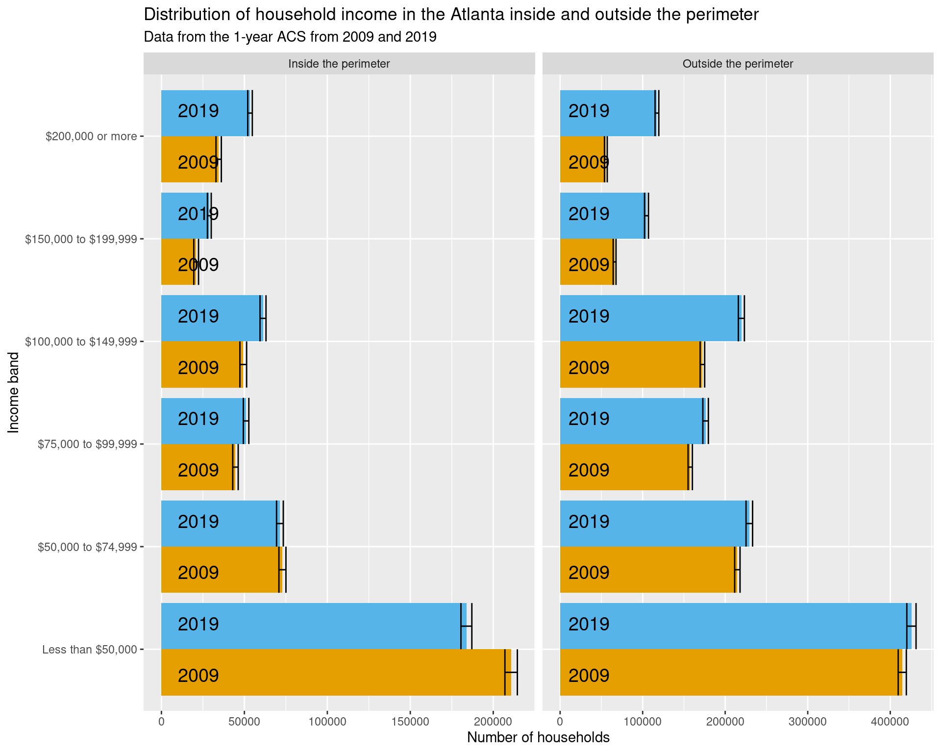
2.3 How has the income distribution changed across census tracts over time?
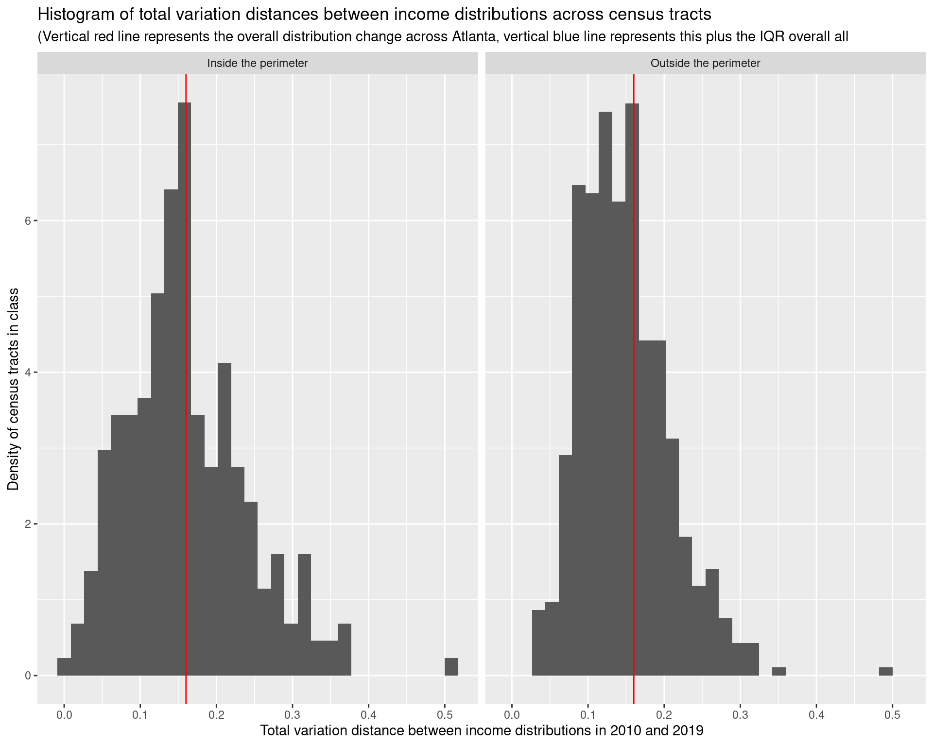
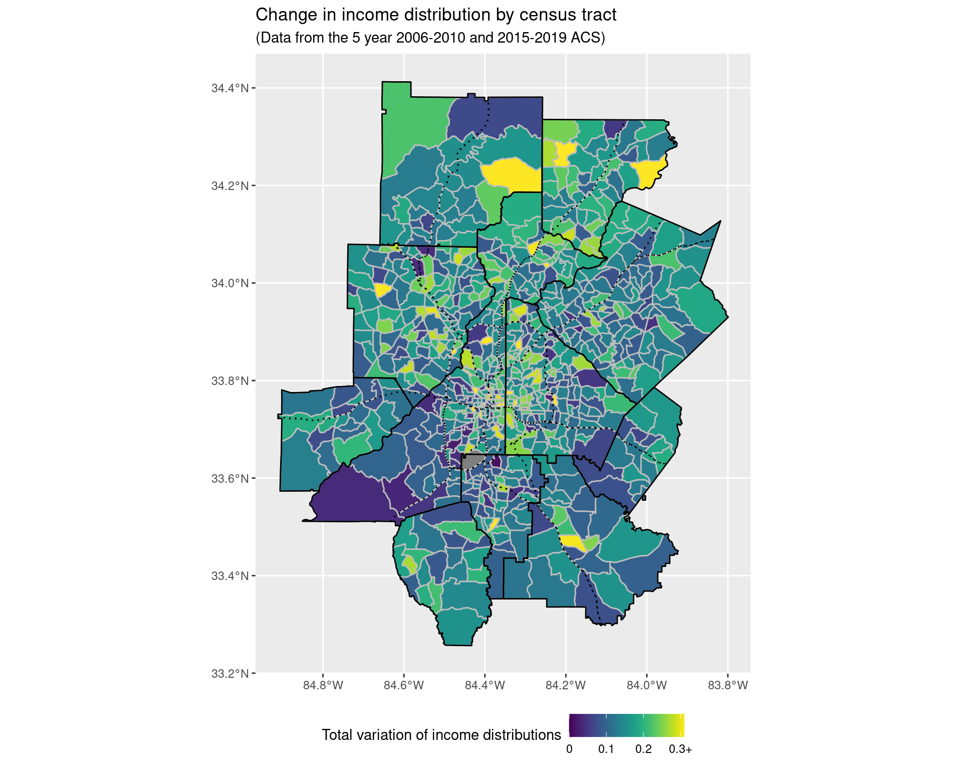
To compare the income distribution across tracts over time, for each census tract, we will look at the proportion of the population in the different income bands, and then compare these between 2010 and 2019. (These time periods were chosen so that there are no issues in switching between different census tracts.) To do so, we will compute the total variation distance between the two distributions; formally, if we have \(K\) different possible values, and we have two sets of proportions labelled \(p(i)\) and \(q(i)\) (where \(i\) can take on \(1\), \(2\), …, or \(K\)), then we compute the value \[ \frac{1}{2} \times \Big( |p(1) - q(1)| + |p(2) - q(2)| + \cdots + |p(K) - q(K)| \Big), \] and use this as a measure of how different \(p\) and \(q\) are. If this distance is zero, then the two distributions are identical; the closer the distance is to one, the greater the difference between the distributions. To try and observe what is happening in relation to some other geographical structures, the major highways beyond that of the interstate have also been added to the plots below as dashed black lines (with the county boundaries given as solid black lines, and the census tract boundaries as solid grey lines).
df_income_tracts <- map_dfr(
    lst(2010, 2019),
    ~ get_acs(
        geography = "tract",
        state = "GA",
        variables = income_var_list,
        year = .x,
        county = arc_counties,
        survey = "acs5",
        geometry = FALSE
    ),
    .id = "year") %>%
    mutate(
        tract = gsub("^(.*?),.*", "\\1", NAME),
        county = gsub("^(.*?), (.*?),.*", "\\2", NAME)
    ) %>%
    select(-NAME) %>%
    relocate(tract, county, .after = GEOID)

df_tracts <- map_dfr(
    lst(2010),
    ~ get_acs(
        geography = "tract",
        state = "GA",
        variables = "B19001_001",
        year = .x,
        county = arc_counties,
        survey = "acs5",
        geometry = TRUE
    ),
    .id = "year") %>%
    select(GEOID, geometry) %>%
    mutate(
        tp = st_intersects(
            st_transform(st_boundary(itp), crs = 4269),
            geometry, sparse = FALSE
        )[1, ],
        itp = st_within(
            geometry,
            st_transform(itp, crs = 4269), sparse = FALSE
        )[, 1],
        itp = tp | itp,
        otp = !itp
    ) %>% select(-tp) %>%
    pivot_longer(
        cols = c(itp, otp),
        names_to = "class",
        values_to = "in_class"
    ) %>%
    filter(in_class == TRUE) %>%
    select(-in_class)

df_total_households_tracts <- df_income_tracts %>%
    filter(variable == 'Total') %>%
    select(year, GEOID, estimate, moe)

df_total_households_tracts2 <- df_total_households_tracts %>%
    filter(year == '2019') %>% select(GEOID, estimate)

df_income_change_long <- df_income_tracts %>%
    filter(variable != "Total") %>%
    select(year, GEOID, variable, estimate) %>%
    mutate(variable = fct_collapse(variable,
            "Less than $50,000" = c(
                "Less than $10,000", "$10,000 to $14,999",
                "$15,000 to $19,999", "$20,000 to $24,999",
                "$25,000 to $29,999", "$30,000 to $34,999",
                "$35,000 to $39,999", "$40,000 to $44,999",
                "$45,000 to $49,999"
            ),
            "$50,000 to $74,999" = c("$50,000 to $59,999", "$60,000 to $74,999"),
            "$75,000 to $99,999" = c("$75,000 to $99,999"),
            "$100,000 to $149,999" = c(
                "$100,000 to $124,999", "$125,000 to $149,999"
            ),
            "$150,000 to $199,999" = c("$150,000 to $199,999"),
            "$200,000 or more" = c("$200,000 or more")
        )) %>%
    group_by(year, GEOID, variable) %>%
    summarize(estimate = sum(estimate)) %>%
    ungroup() %>%
    mutate(
        variable = factor(variable, ordered = TRUE, levels = income_var_labels)
    )

df_income_change_tracts <- df_income_change_long %>%
    group_by(year, GEOID) %>%
    mutate(estimate = estimate / sum(estimate)) %>%
    pivot_wider(
        names_from = year,
        names_prefix = "estimate_",
        values_from = estimate
    ) %>%
    mutate(
        diff = abs(estimate_2019 - estimate_2010)
    ) %>%
    group_by(GEOID) %>%
    summarize(income_dist_change = 0.5*sum(diff)) %>%
    left_join(df_tracts)

df_income_change_overall <- df_income_change_long %>%
    group_by(year) %>%
    mutate(estimate = estimate / sum(estimate)) %>%
    pivot_wider(
        names_from = year,
        names_prefix = "estimate_",
        values_from = estimate
    ) %>%
    mutate(
        diff = abs(estimate_2010 - estimate_2019)
    ) %>%
    summarize(income_dist_change = 0.5 * sum(diff))

plot(
    df_total_households_tracts2$estimate, df_income_change_tracts$income_dist_change,
    col = factor(df_tracts$class),
    xlab = "Number of households in census tract in 2019",
    ylab = "Total variation of income distribution change in census tract",
    main = "Number of households vs income change across census tracts",
    sub = "(Horizontal red line corresponds to level of income change across all Atlanta)"
)
abline(h = as.numeric(df_income_change_overall), col = "red", lwd = 3)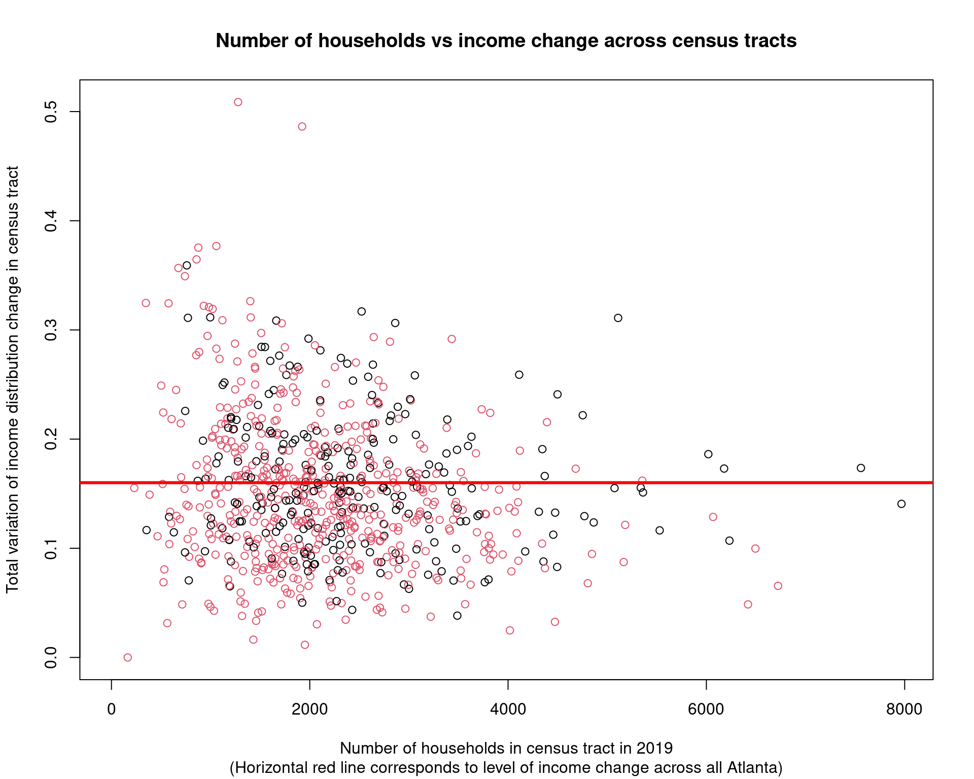
df_income_change_tracts %>%
    mutate(
        class = recode_factor(factor(class),
            itp = "Inside the perimeter", otp = "Outside the perimeter"
    )) %>%
    select(-geometry) %>%
    ggplot(aes(x = income_dist_change, after_stat(density))) +
    geom_histogram() + facet_wrap( ~ class) +
    geom_vline(
        xintercept = as.numeric(df_income_change_overall),
        col = "red"
    ) +
    labs(
        x = "Total variation distance between income distributions in 2010 and 2019",
        title = "Histogram of total variation distances between income distributions across census tracts",
        y = "Density of census tracts in class",
        subtitle = "(Vertical red line represents the overall distribution change across Atlanta, vertical blue line represents this plus the IQR overall all"
    )
ggplot() +
    geom_sf(
        data = df_income_change_tracts %>%
            mutate(income_dist_change = pmin(income_dist_change, 0.31)),
        aes(geometry = geometry, fill = income_dist_change),
        colour = "grey"
    ) + scale_fill_viridis(
        labels = c(0, 0.1, 0.2, "0.3+")
    ) +
    geom_sf(data = arc_counties_shp, colour = "black", fill = NA) +
    geom_sf(data = highway_arc, colour = "#000000", lty = 3, fill = NA) +
    theme(legend.position = "bottom") +
    labs(
        fill = "Total variation of income distributions",
        title = "Change in income distribution by census tract",
        subtitle = "(Data from the 5 year 2006-2010 and 2015-2019 ACS)"
    )
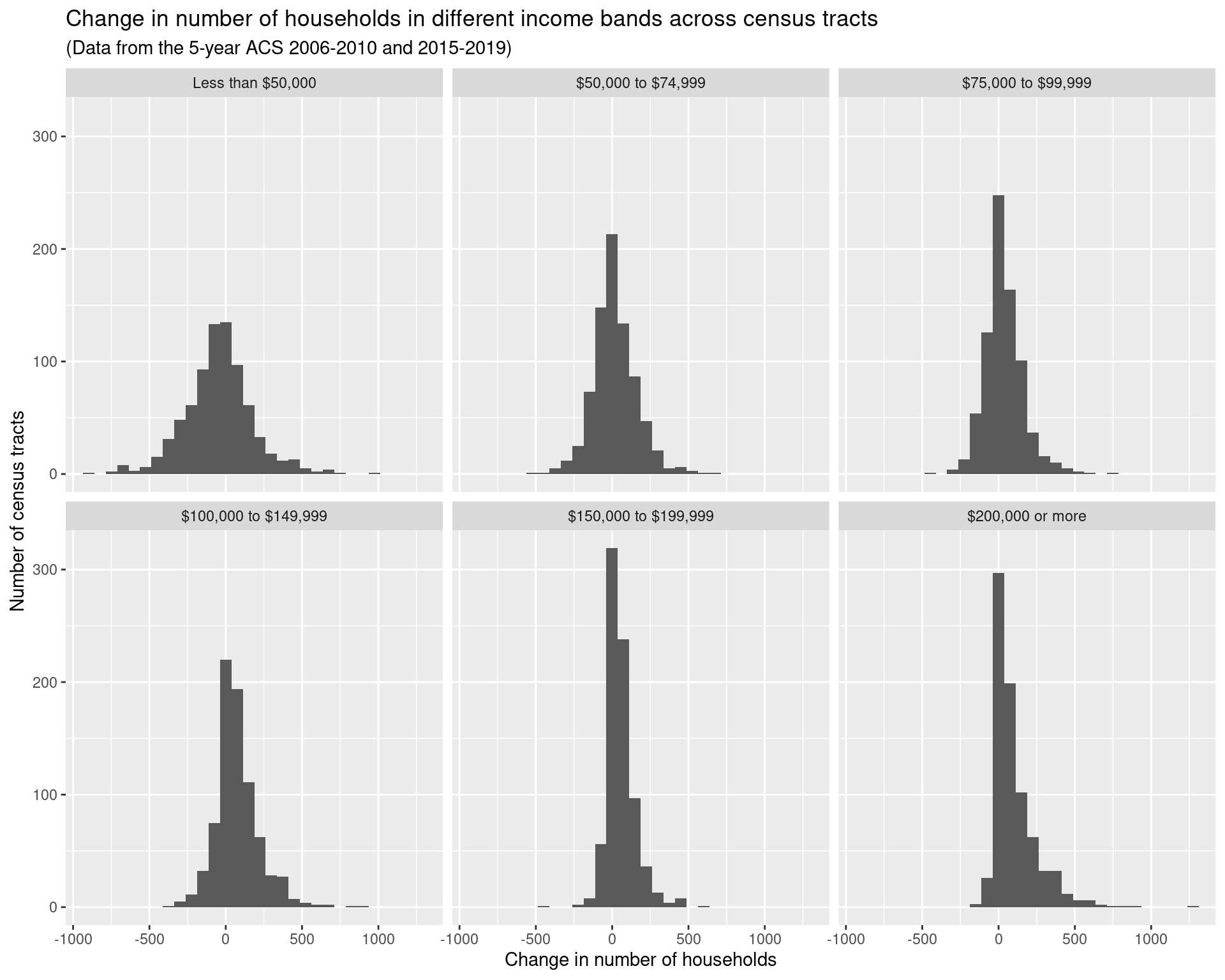
This seems pretty abstract, and so instead we’ll look at some “extreme groups”:
- households earning more than $200k,
- households earning less than $50k;
- households earning between $50k and $75k;
and see where the numbers of these households/proportions have been increasing and decreasing in number the largest.
df_rdincome_tracts <- df_income_tracts %>%
    filter(variable != "Total") %>%
    select(year, GEOID, variable, estimate) %>%
    mutate(variable = fct_collapse(variable,
        "Less than $50,000" = c(
            "Less than $10,000", "$10,000 to $14,999",
            "$15,000 to $19,999", "$20,000 to $24,999",
            "$25,000 to $29,999", "$30,000 to $34,999",
            "$35,000 to $39,999", "$40,000 to $44,999",
            "$45,000 to $49,999"
        ),
        "$50,000 to $74,999" = c("$50,000 to $59,999", "$60,000 to $74,999"),
        "$75,000 to $99,999" = c("$75,000 to $99,999"),
        "$100,000 to $149,999" = c(
            "$100,000 to $124,999", "$125,000 to $149,999"
        ),
        "$150,000 to $199,999" = c("$150,000 to $199,999"),
        "$200,000 or more" = c("$200,000 or more")
    )) %>%
    mutate(
        variable = factor(variable, ordered = TRUE, levels = income_var_labels)
    ) %>%
    group_by(year, GEOID, variable) %>%
    summarize(estimate = sum(estimate)) %>%
    left_join(df_tracts)

p2010 <- ggplot() +
    geom_sf(
        data = df_rdincome_tracts %>% filter(year == '2010'),
        aes(geometry = geometry, fill = estimate),
        colour = "grey", lwd = 0.25
    ) + scale_fill_viridis(option = "viridis", trans = 'sqrt') +
    facet_wrap(~ variable) +
    geom_sf(data = arc_counties_shp, colour = "black", fill = NA) +
    geom_sf(data = highway_arc, colour = "#f100e5", fill = NA) +
    theme(legend.position = "bottom") +
    labs(
        fill = "Number of households",
        title = "Number of households by income band and tract",
        subtitle = "(Data using 5-year estimates from the 2006-2010 ACS)"
    ) +
    theme(legend.key.width = unit(2, 'cm'))

p2019 <- ggplot() +
    geom_sf(
        data = df_rdincome_tracts %>% filter(year == '2019'),
        aes(geometry = geometry, fill = estimate),
        colour = "grey", lwd = 0.25
    ) + scale_fill_viridis(option = "viridis", trans = 'log10') +
    facet_wrap(~ variable) +
    geom_sf(data = arc_counties_shp, colour = "black", fill = NA) +
    geom_sf(data = highway_arc, colour = "#f100e5", fill = NA) +
    theme(legend.position = "bottom") +
    labs(
        fill = "Number of households",
        title = "Number of households by income band and tract",
        subtitle = "(Data using 5-year estimates from the 2015-2019 ACS)"
    ) +
    theme(legend.key.width = unit(2, 'cm'))

df_rdincome_change_tracts <- df_income_tracts %>%
    filter(variable != "Total") %>%
    select(year, GEOID, variable, estimate) %>%
    mutate(variable = fct_collapse(variable,
        "Less than $50,000" = c(
            "Less than $10,000", "$10,000 to $14,999",
            "$15,000 to $19,999", "$20,000 to $24,999",
            "$25,000 to $29,999", "$30,000 to $34,999",
            "$35,000 to $39,999", "$40,000 to $44,999",
            "$45,000 to $49,999"
        ),
        "$50,000 to $74,999" = c("$50,000 to $59,999", "$60,000 to $74,999"),
        "$75,000 to $99,999" = c("$75,000 to $99,999"),
        "$100,000 to $149,999" = c(
            "$100,000 to $124,999", "$125,000 to $149,999"
        ),
        "$150,000 to $199,999" = c("$150,000 to $199,999"),
        "$200,000 or more" = c("$200,000 or more")
    )) %>%
    mutate(
        variable = factor(variable, ordered = TRUE, levels = income_var_labels)
    ) %>%
    group_by(year, GEOID, variable) %>%
    summarize(estimate = sum(estimate)) %>%
    pivot_wider(
        names_from = "year",
        names_prefix = "estimate_",
        values_from = "estimate"
    ) %>%
    mutate(change = estimate_2019 - estimate_2010) %>%
    left_join(df_tracts)

df_rdincome_change_tracts %>%
    ggplot(aes(x = change)) + geom_histogram() +
    facet_wrap(~ variable) +
    labs(
        x = "Change in number of households",
        y = "Number of census tracts",
        title = "Change in number of households in different income bands across census tracts",
        subtitle = "(Data from the 5-year ACS 2006-2010 and 2015-2019)"
    )
df_rdincome_prop_tracts <- df_income_tracts %>%
    filter(variable != "Total") %>%
    select(year, GEOID, variable, estimate) %>%
    mutate(variable = fct_collapse(variable,
        "Less than $50,000" = c(
            "Less than $10,000", "$10,000 to $14,999",
            "$15,000 to $19,999", "$20,000 to $24,999",
            "$25,000 to $29,999", "$30,000 to $34,999",
            "$35,000 to $39,999", "$40,000 to $44,999",
            "$45,000 to $49,999"
        ),
        "$50,000 to $74,999" = c("$50,000 to $59,999", "$60,000 to $74,999"),
        "$75,000 to $99,999" = c("$75,000 to $99,999"),
        "$100,000 to $149,999" = c(
            "$100,000 to $124,999", "$125,000 to $149,999"
        ),
        "$150,000 to $199,999" = c("$150,000 to $199,999"),
        "$200,000 or more" = c("$200,000 or more")
    )) %>%
    mutate(
        variable = factor(variable, ordered = TRUE, levels = income_var_labels)
    ) %>%
    group_by(year, GEOID, variable) %>%
    summarize(estimate = sum(estimate)) %>%
    group_by(year, GEOID) %>%
    mutate(estimate = estimate / sum(estimate)) %>%
    left_join(df_tracts)

pincome2010 <- ggplot() +
    geom_sf(
        data = df_rdincome_prop_tracts %>% filter(year == '2010'),
        aes(geometry = geometry, fill = estimate),
        colour = "grey", lwd = 0.25
    ) + scale_fill_viridis(option = "viridis", trans = 'sqrt') +
    facet_wrap(~ variable) +
    geom_sf(data = arc_counties_shp, colour = "black", fill = NA) +
    geom_sf(data = highway_arc, colour = "#f100e5", fill = NA) +
    theme(legend.position = "bottom") +
    labs(
        fill = "Proportion of households",
        title = "Proportion of households by income band in census tracts",
        subtitle = "(Data using 5-year estimates from the 2006-2010 ACS)"
    ) +
    theme(legend.key.width = unit(2, 'cm'))

pincome2019 <- ggplot() +
    geom_sf(
        data = df_rdincome_prop_tracts %>% filter(year == '2019'),
        aes(geometry = geometry, fill = estimate),
        colour = "grey", lwd = 0.25
    ) + scale_fill_viridis(option = "viridis", trans = 'log10') +
    facet_wrap(~ variable) +
    geom_sf(data = arc_counties_shp, colour = "black", fill = NA) +
    geom_sf(data = highway_arc, colour = "#f100e5", fill = NA) +
    theme(legend.position = "bottom") +
    labs(
        fill = "Proportion of households",
        title = "Proportion of households by income band in census tracts",
        subtitle = "(Data using 5-year estimates from the 2015-2019 ACS)"
    ) +
    theme(legend.key.width = unit(2, 'cm'))

df_rdincome_prop_change_tracts <- df_income_tracts %>%
    filter(variable != "Total") %>%
    select(year, GEOID, variable, estimate) %>%
    mutate(variable = fct_collapse(variable,
        "Less than $50,000" = c(
            "Less than $10,000", "$10,000 to $14,999",
            "$15,000 to $19,999", "$20,000 to $24,999",
            "$25,000 to $29,999", "$30,000 to $34,999",
            "$35,000 to $39,999", "$40,000 to $44,999",
            "$45,000 to $49,999"
        ),
        "$50,000 to $74,999" = c("$50,000 to $59,999", "$60,000 to $74,999"),
        "$75,000 to $99,999" = c("$75,000 to $99,999"),
        "$100,000 to $149,999" = c(
            "$100,000 to $124,999", "$125,000 to $149,999"
        ),
        "$150,000 to $199,999" = c("$150,000 to $199,999"),
        "$200,000 or more" = c("$200,000 or more")
    )) %>%
    mutate(
        variable = factor(variable, ordered = TRUE, levels = income_var_labels)
    ) %>%
    group_by(year, GEOID, variable) %>%
    summarize(estimate = sum(estimate)) %>%
    group_by(year, GEOID) %>%
    mutate(estimate = estimate / sum(estimate)) %>%
    ungroup() %>%
    pivot_wider(
        names_from = "year",
        names_prefix = "estimate_",
        values_from = "estimate"
    ) %>%
    mutate(change = estimate_2019 - estimate_2010) %>%
    left_join(df_tracts)

df_rdincome_prop_change_tracts %>%
    ggplot(aes(x = change)) + geom_histogram() +
    facet_wrap(~ variable)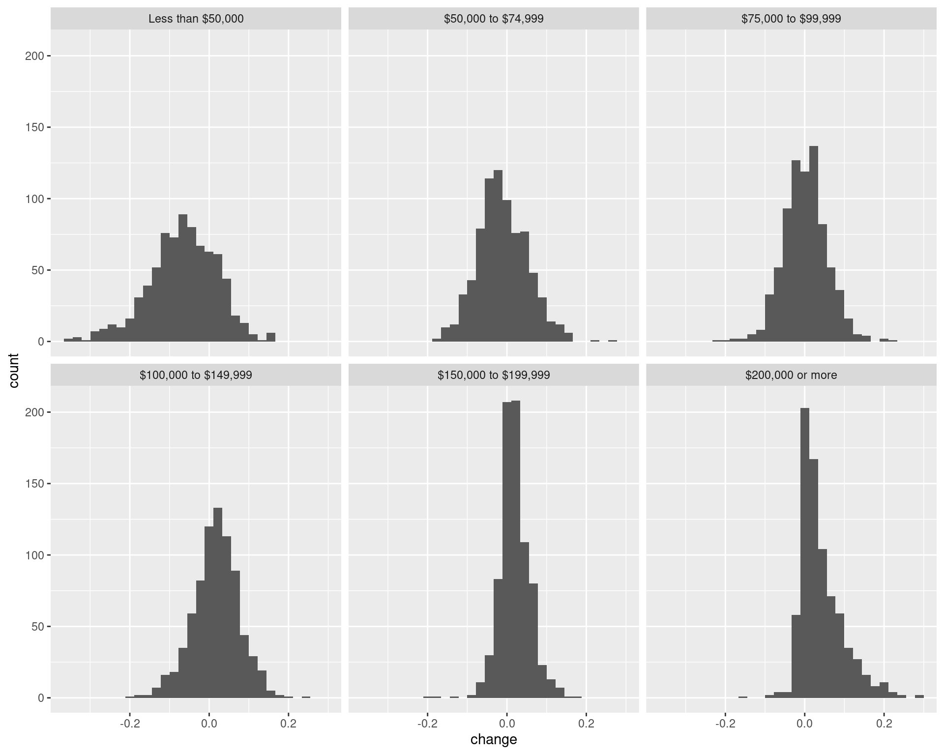
p1 <- ggplot() +
    geom_sf(
        data = df_rdincome_prop_change_tracts %>%
            mutate(change = pminmax(change, -0.2, 0.2)),
        aes(geometry = geometry, fill = change),
        colour = "grey", lwd = 0.25
    ) + scale_fill_viridis(
        option = "turbo",
        labels = c("<= -0.2", -0.1, 0, 0.1, "0.2 <=")
    ) +
    facet_wrap(~ variable) +
    geom_sf(data = arc_counties_shp, colour = "black", fill = NA) +
    geom_sf(data = highway_arc, colour = "black", lty = 3, fill = NA) +
    theme(legend.position = "bottom") +
    labs(
        fill = "Change in proportion of households",
        title = "Change in proportion of households in income band by tract",
        subtitle = "(Data using 5-year estimates from the 2006-2010 ACS and 2015-2019 ACS)"
    ) +
    theme(legend.key.width = unit(2, 'cm'))

p1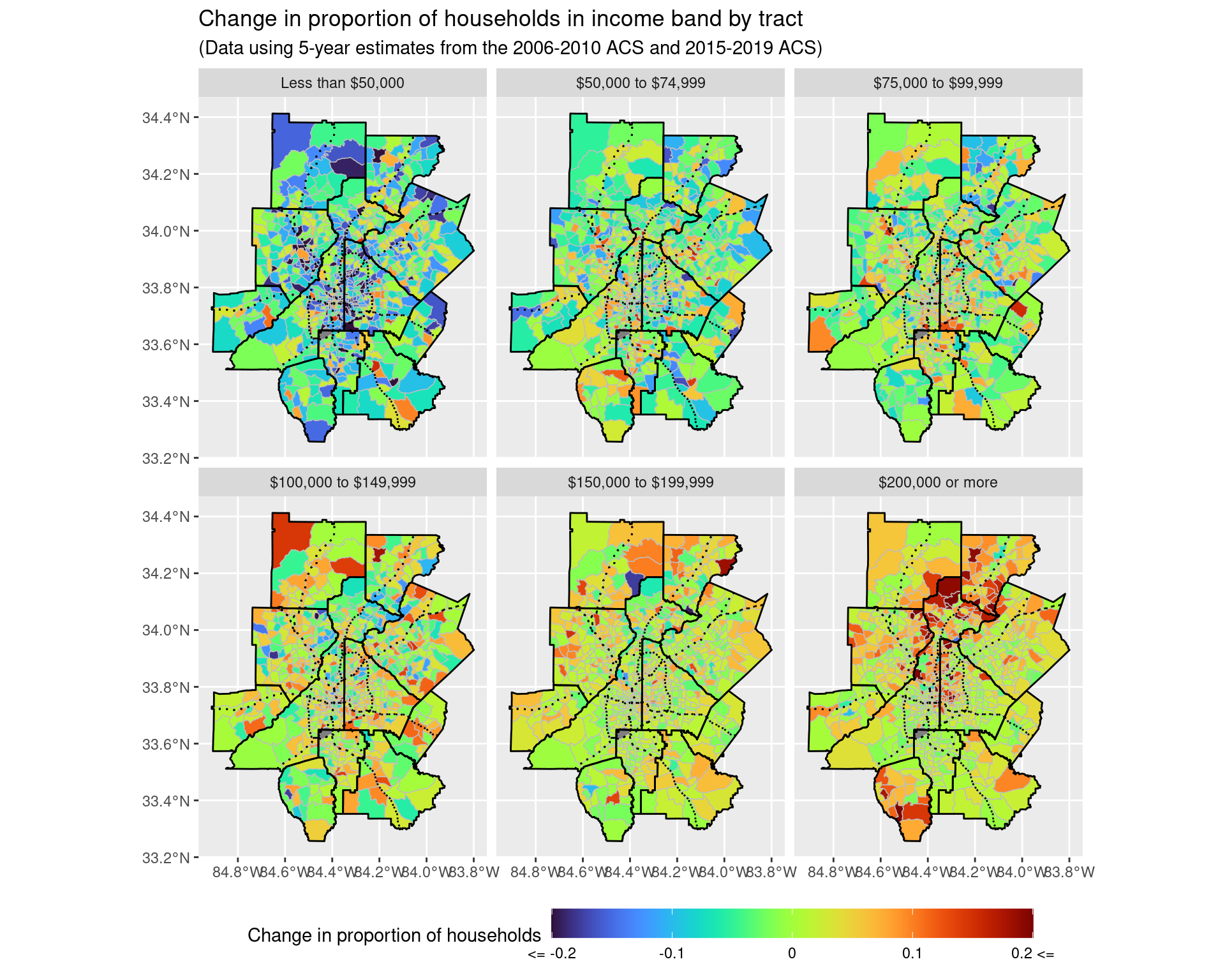
ggsave("img-files/income_changes_tract_income_prop.pdf")

p2 <- ggplot() +
    geom_sf(
        data = df_rdincome_prop_change_tracts %>%
            mutate(change = pminmax(change, -0.2, 0.2)) %>%
            filter(variable %in% c("Less than $50,000", "$200,000 or more")),
        aes(geometry = geometry, fill = change),
        colour = "grey", lwd = 0.25
    ) +
    scale_fill_viridis(
        option = "turbo",
        labels = c("<= -0.2", -0.1, 0, 0.1, "0.2 <=")
    ) +
    facet_wrap(~ variable) +
    geom_sf(data = arc_counties_shp, colour = "black", fill = NA) +
    geom_sf(data = highway_arc, colour = "black", lty = 3, fill = NA) +
    theme(legend.position = "bottom") +
    labs(
        fill = "Change in proportion of households",
        title = "Change in proportion of households in income band by tract",
        subtitle = "(Data using 5-year estimates from the 2006-2010 ACS and 2015-2019 ACS)"
    ) +
    theme(legend.key.width = unit(2, 'cm'))

p2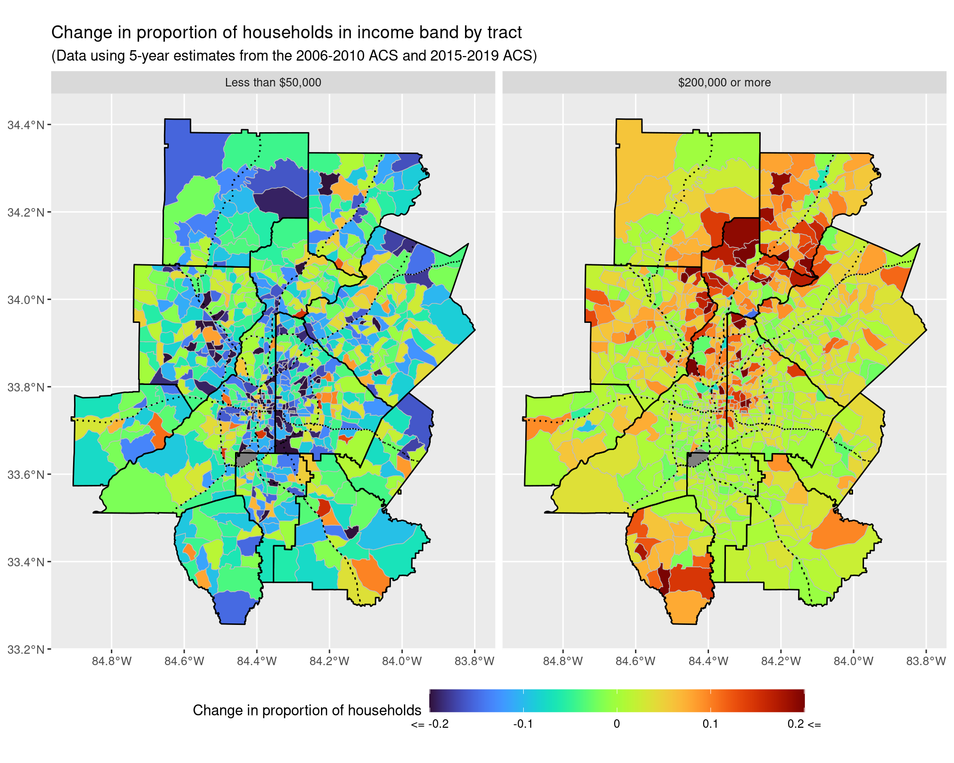
ggsave("img-files/income_changes_tract_income_prop_highlow.pdf")Let’s zoom inside the perimeter to see what is happening here a bit more carefully.
p1 + coord_sf(xlim = c(-84.53, -84.2), ylim = c(33.6, 33.95), expand = FALSE)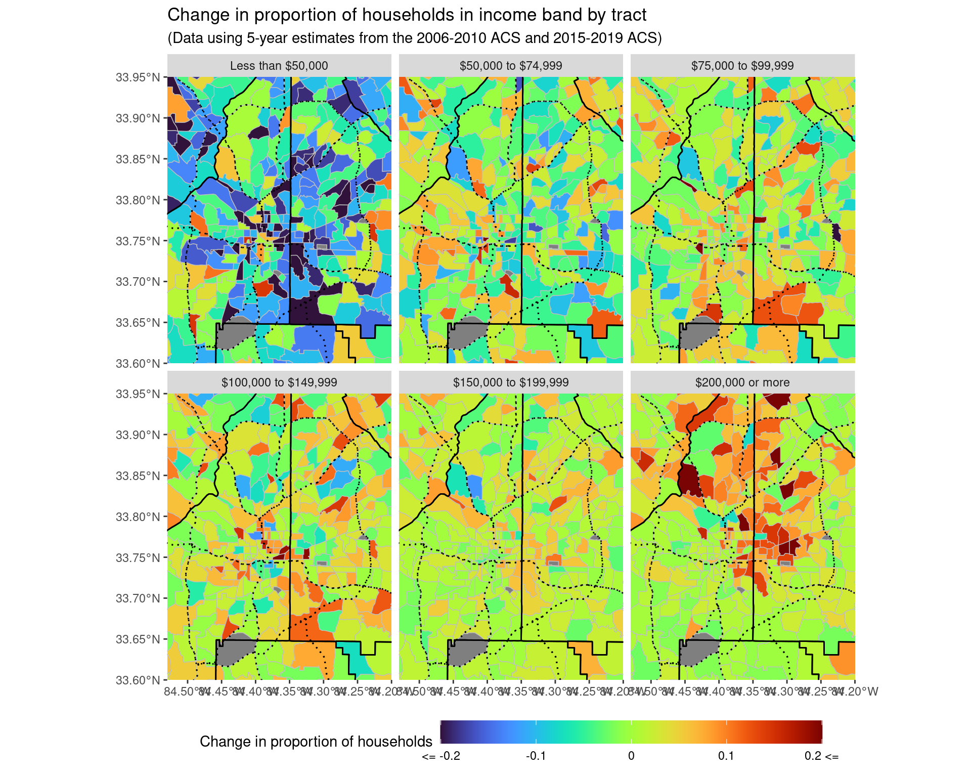
ggsave("img-files/income_changes_tract_income_prop_itp.pdf")

p2 + coord_sf(xlim = c(-84.53, -84.2), ylim = c(33.6, 33.95), expand = FALSE) 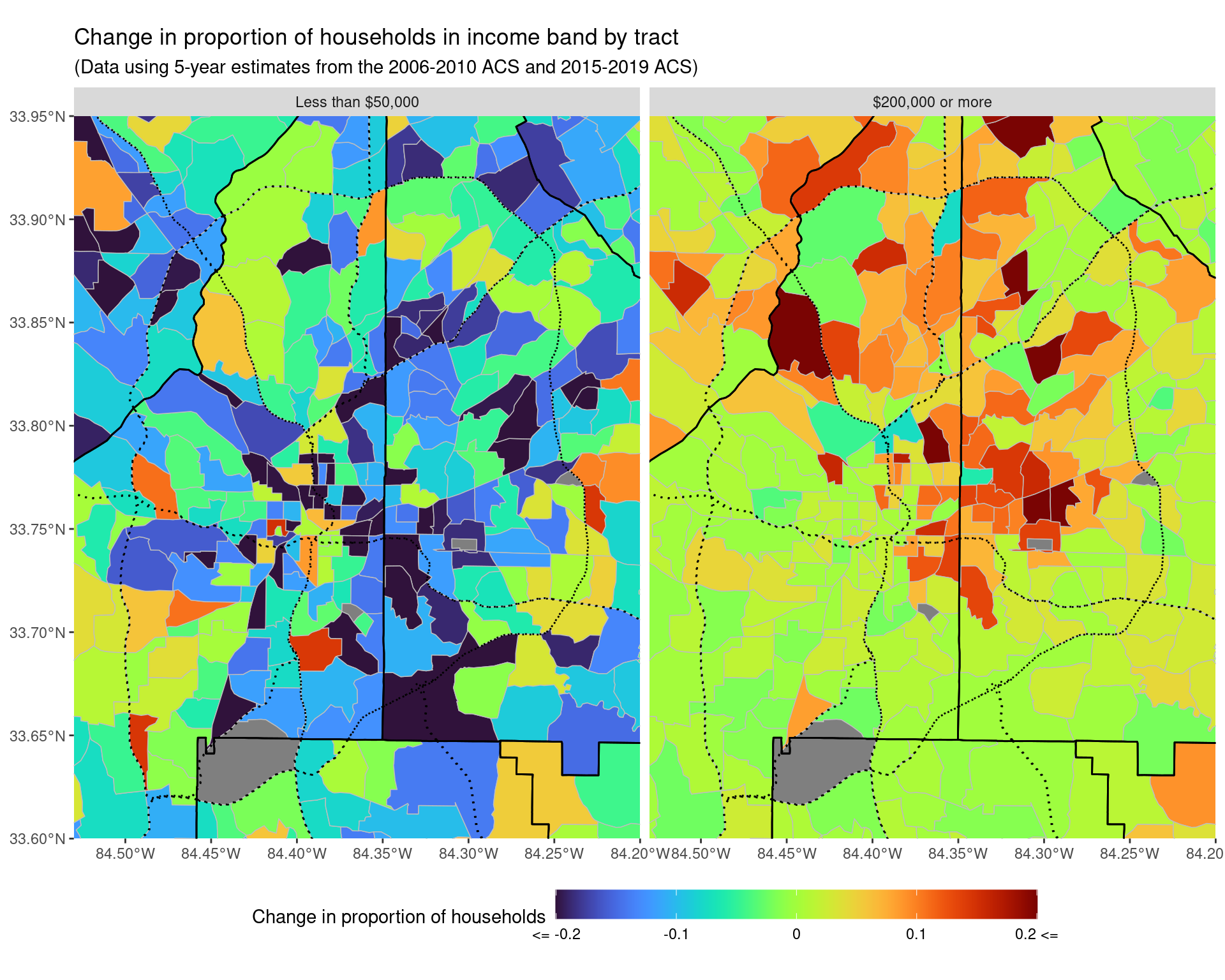
ggsave("img-files/income_changes_tract_income_prop_highlow_itp.pdf")Let’s also just look at the actual numbers of households, rather than the change in proportions over time. (This should let us see if the effects we are seeing are due to chance, or are of evidence of an actual pattern).
df_rdincome_total_change_tracts <- df_income_tracts %>%
    filter(variable != "Total") %>%
    select(year, GEOID, variable, estimate, moe) %>%
    mutate(variable = fct_collapse(variable,
        "Less than $50,000" = c(
            "Less than $10,000", "$10,000 to $14,999",
            "$15,000 to $19,999", "$20,000 to $24,999",
            "$25,000 to $29,999", "$30,000 to $34,999",
            "$35,000 to $39,999", "$40,000 to $44,999",
            "$45,000 to $49,999"
        ),
        "$50,000 to $74,999" = c("$50,000 to $59,999", "$60,000 to $74,999"),
        "$75,000 to $99,999" = c("$75,000 to $99,999"),
        "$100,000 to $149,999" = c(
            "$100,000 to $124,999", "$125,000 to $149,999"
        ),
        "$150,000 to $199,999" = c("$150,000 to $199,999"),
        "$200,000 or more" = c("$200,000 or more")
    )) %>%
    mutate(
        variable = factor(variable, ordered = TRUE, levels = income_var_labels)
    ) %>%
    group_by(year, GEOID, variable) %>%
    summarize(
        estimate = sum(estimate),
        moe = sqrt(sum(moe**2))
    ) %>%
    ungroup() %>%
    pivot_wider(
        names_from = "year",
        values_from = c("estimate", "moe")
    ) %>%
    mutate(
        change = estimate_2019 - estimate_2010,
        ratio = estimate_2019 / estimate_2010,
        log_ratio_moe = sqrt((moe_2019/estimate_2019)**2 + (moe_2010/estimate_2010)**2)
    ) %>%
    left_join(df_tracts)

p1_total <- ggplot() +
    geom_sf(
        data = df_rdincome_total_change_tracts %>%
        mutate(change = pminmax(change, -500, 500)),
        aes(geometry = geometry, fill = change),
        colour = "grey", lwd = 0.25
    ) + scale_fill_viridis(
        option = "turbo",
        labels = c("<= -500", -250, 0, 250, "500 <=")
    ) +
    facet_wrap(~ variable) +
    geom_sf(data = arc_counties_shp, colour = "black", fill = NA) +
    geom_sf(data = highway_arc, colour = "black", lty = 3, fill = NA) +
    theme(legend.position = "bottom") +
    labs(
        fill = "Change in number of households",
        title = "Change in number of households in income band by tract",
        subtitle = "(Data using 5-year estimates from the 2006-2010 ACS and 2015-2019 ACS)"
    ) +
    theme(legend.key.width = unit(2, 'cm'))

p1_total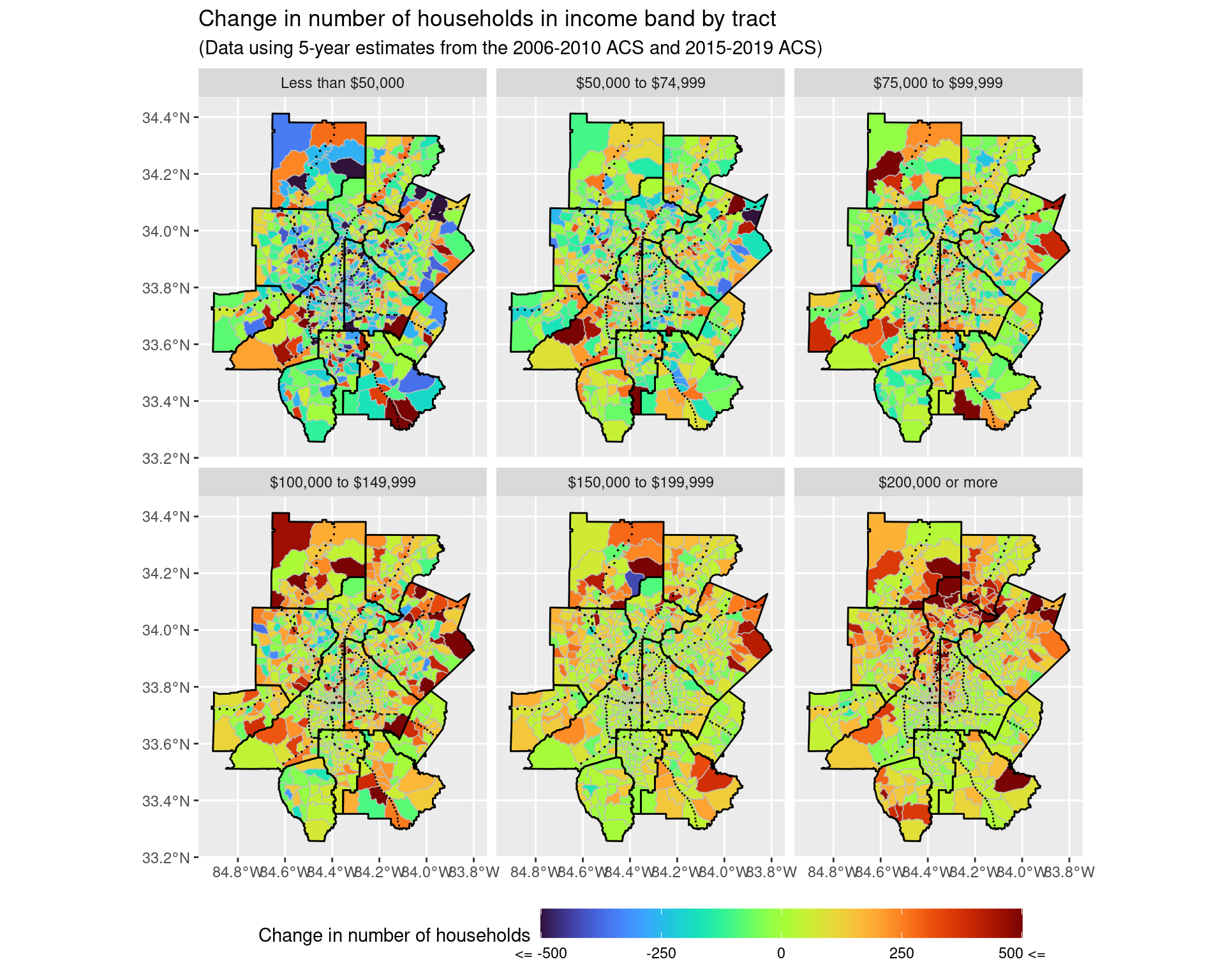
ggsave("img-files/income_changes_tract_income_net_change.pdf")

p2_total <- ggplot() +
    geom_sf(
        data = df_rdincome_total_change_tracts %>%
            mutate(change = pminmax(change, -500, 500)) %>%
            filter(variable %in% c("Less than $50,000", "$200,000 or more")),
        aes(geometry = geometry, fill = change),
        colour = "grey", lwd = 0.25
    ) + scale_fill_viridis(
        option = "turbo",
        labels = c("<= -500", -250, 0, 250, "500 <=")
    ) +
    facet_wrap(~ variable) +
    geom_sf(data = arc_counties_shp, colour = "black", fill = NA) +
    geom_sf(data = highway_arc, colour = "black", lty = 3, fill = NA) +
    theme(legend.position = "bottom") +
    labs(
        fill = "Change in number of households",
        title = "Change in number of households in income band by tract",
        subtitle = "(Data using 5-year estimates from the 2006-2010 ACS and 2015-2019 ACS)"
    ) +
    theme(legend.key.width = unit(2, 'cm'))

p2_total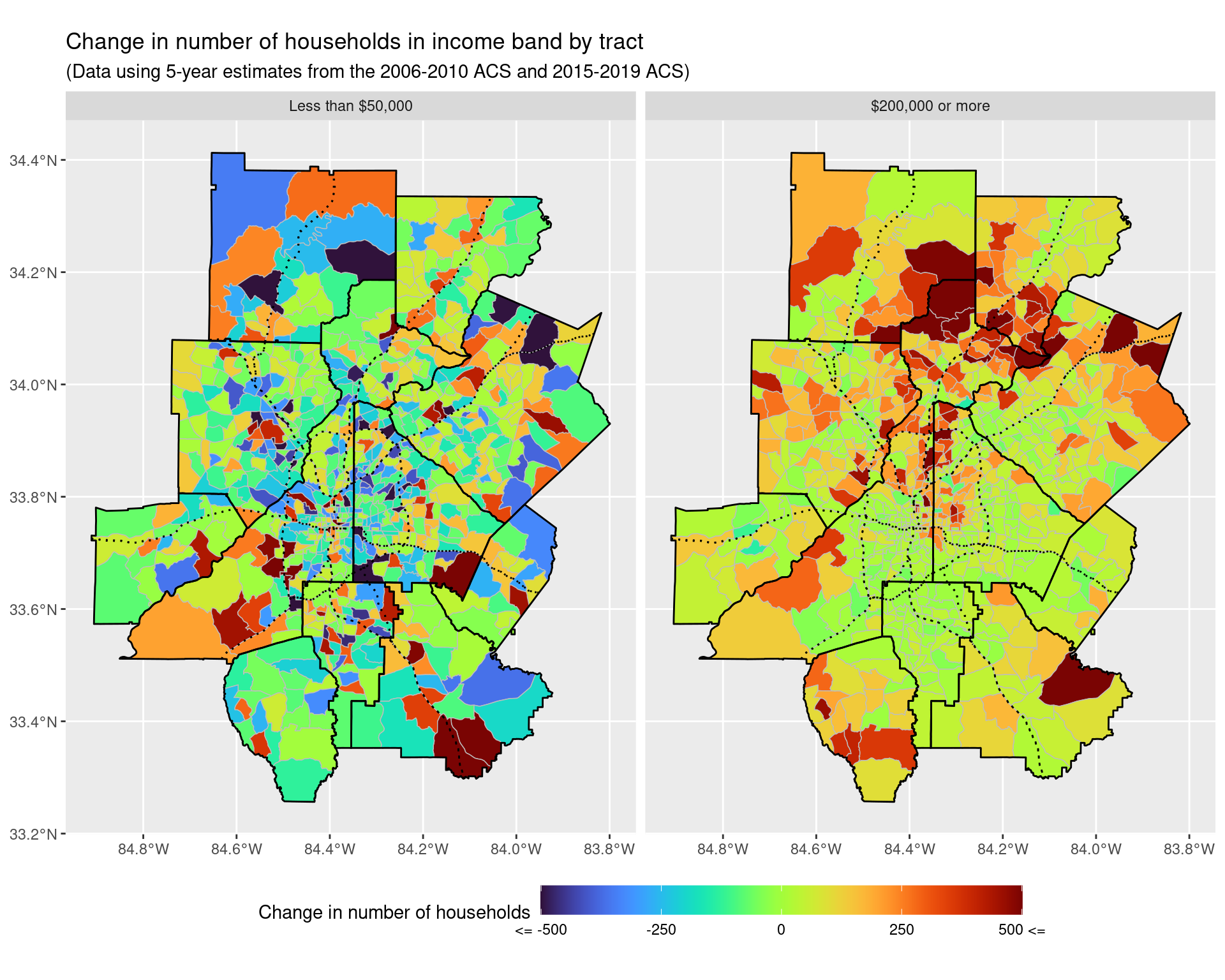
ggsave("img-files/income_changes_tract_income_net_change_highlow.pdf")p1_total + coord_sf(xlim = c(-84.53, -84.2), ylim = c(33.6, 33.95), expand = FALSE)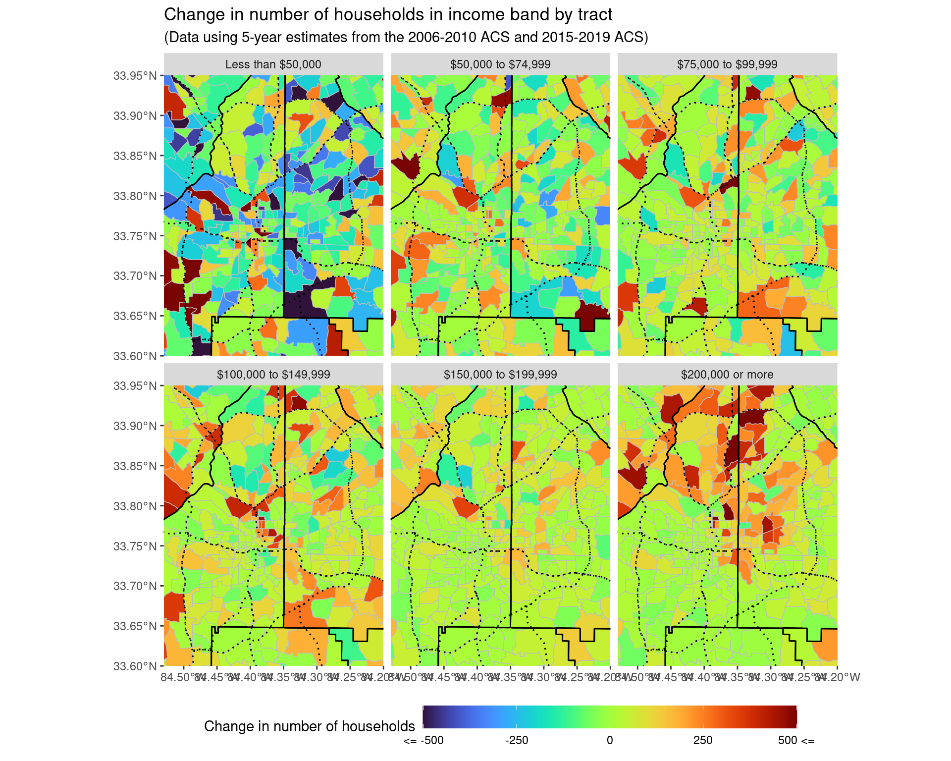
ggsave("img-files/income_changes_tract_income_net_change_itp.pdf")

p2_total + coord_sf(xlim = c(-84.53, -84.2), ylim = c(33.6, 33.95), expand = FALSE) 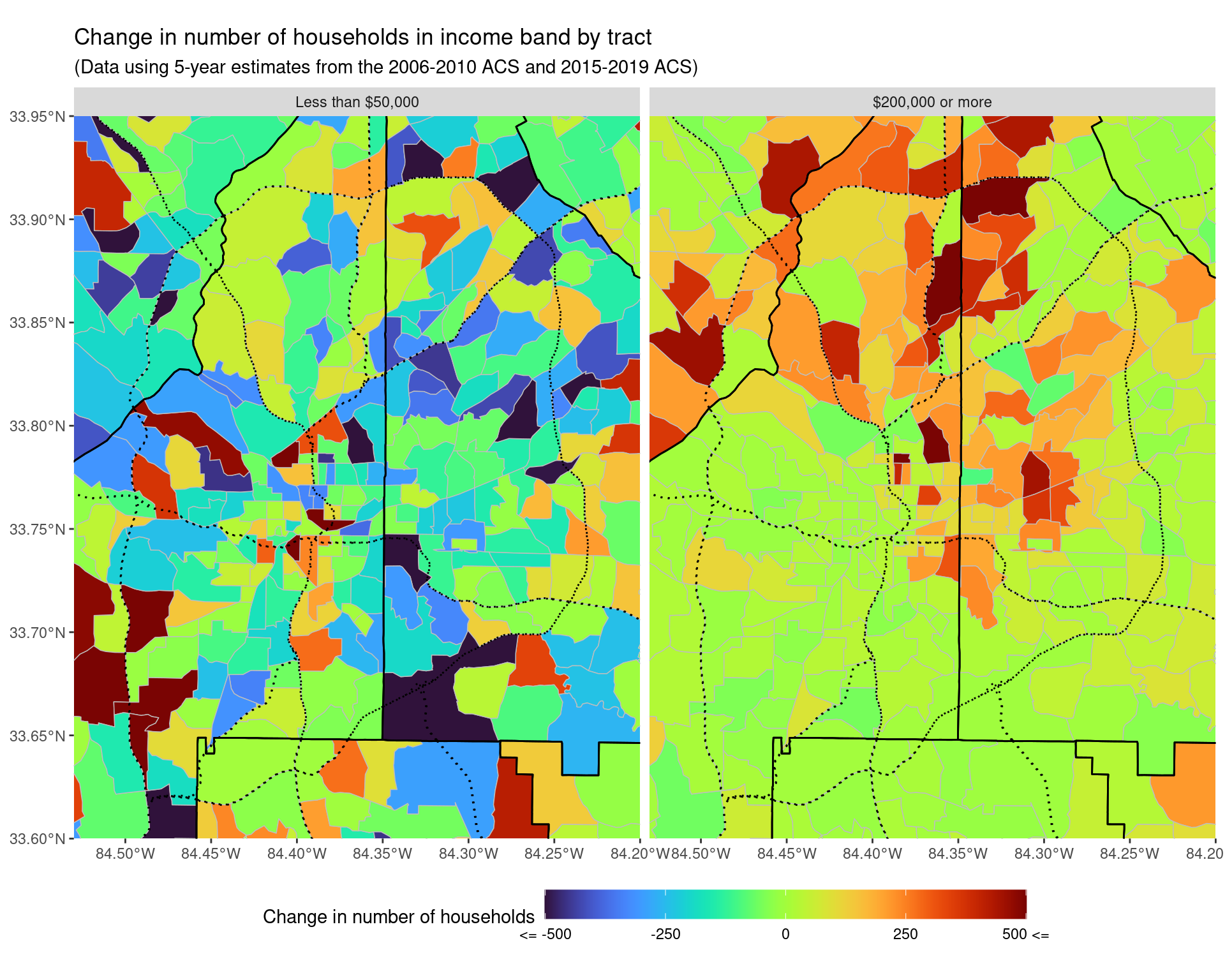
ggsave("img-files/income_changes_tract_income_net_change_highlow_itp.pdf")3 Migration patterns - income of people moving inside census tracts
income_variables <- paste0("B07010_0", str_pad(1:66, 2, pad = "0"))

income_variables_df <- v11 %>%
    filter(name %in% income_variables) %>%
    select(name, label) %>%
    separate(
        label,
        c('estimate', 'total', 'moved', 'income', 'band'),
        sep = "!!"
    ) %>%
    drop_na() %>%
    select(name, moved, band) %>%
    filter(moved != "Moved from abroad") %>%
    mutate(
        in_out_state = fct_collapse(
            as_factor(moved),
            "Same house 1 year ago" = "Same house 1 year ago",
            "Moved in-state" = c(
                "Moved within same county",
                "Moved from different county within same state",
                "Moved from different state"
            ),
            "Moved from out-of-state" = c("Moved from different state")
        ),
        band = fct_collapse(
            as_factor(band),
            "$1 to $14,999" = c(
                "$1 to $9,999 or loss", "$10,000 to $14,999"
            ),
            "$15,000 to $34,999" = c(
                "$15,000 to $24,999", "$25,000 to $34,999"
            ),
            "$35,000 to $49,999" = "$35,000 to $49,999",
            "$50,000 to $74,999" = c(
                "$50,000 to $64,999", "$65,000 to $74,999"
            ),
            "$75,000 or more" = "$75,000 or more"
        )
    )

df_income_in <- map_dfr(
    years_acs1,
    ~ get_acs(
        geography = "county",
        state = "GA",
        variables = income_variables,
        year = .x,
        county = arc_counties,
        survey = "acs1",
        geometry = FALSE
    ),
    .id = "year") %>%
    mutate(county = gsub("^(.*?),.*", "\\1", NAME)) %>%
    select(-NAME) %>%
    relocate(county, .after = GEOID)

df_income_in %>%
    left_join(income_variables_df, by = c("variable" = "name")) %>%
    mutate(year = as.Date(paste(year, 1, 1, sep = "-"))) %>%
    drop_na() %>%
    group_by(year, in_out_state, band) %>%
    summarize(
        estimate = sum(estimate),
        moe = sqrt(sum(moe**2))
    ) %>%
    filter(str_detect(in_out_state, "Moved")) %>%
    ggplot(aes(
        x = year, y = estimate, ymin = estimate - moe,
        ymax = estimate + moe, col = band, fill = band)
    ) + geom_line() +
    geom_point() +
    geom_ribbon(alpha = 0.15, show.legend = FALSE) +
    theme(legend.position = "bottom") +
    facet_wrap( ~ in_out_state, scales = "free") +
    scale_x_date(date_labels = "%Y", date_breaks = "1 year") +
    labs(
        x = "Year", y = "Number of Individuals",
        col = "Individual Income",
        title = "Distribution of income of individuals who moved into Atlanta from out of state",
        subtitle = "Data from 1-year ACS from 2009 to 2019"
    ) +
    guides(fill = "none")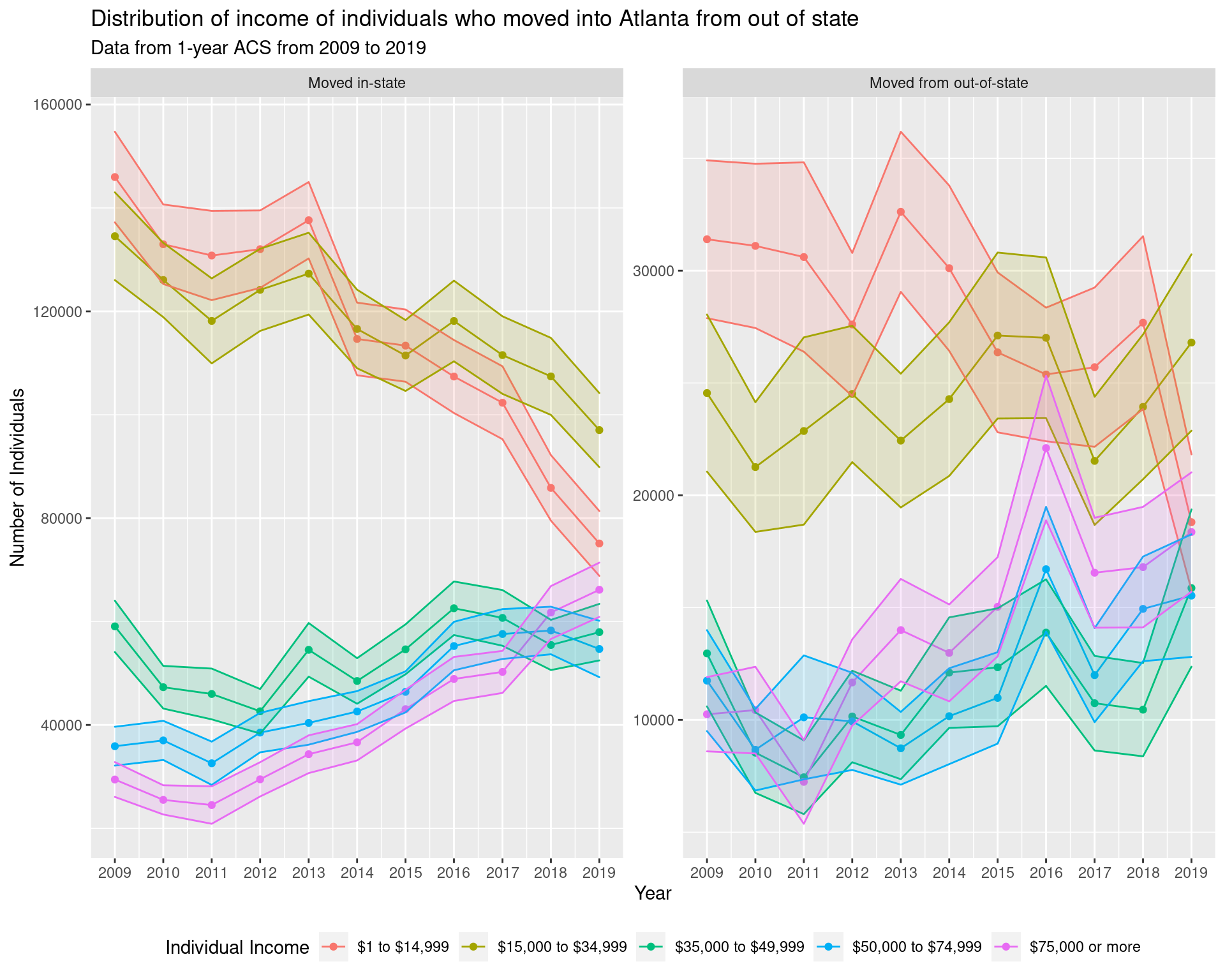
ggsave("img-files/income_out_of_state.pdf")

df_income_in_5yr <- map_dfr(
    years_acs5,
    ~ get_acs(
        geography = "county",
        state = "GA",
        variables = income_variables,
        year = .x,
        county = arc_counties,
        survey = "acs5",
        geometry = FALSE
    ),
    .id = "year") %>%
    mutate(county = gsub("^(.*?),.*", "\\1", NAME)) %>%
    select(-NAME) %>%
    relocate(county, .after = GEOID)

df_income_in_5yr %>%
    left_join(income_variables_df, by = c("variable" = "name")) %>%
    mutate(year = as.Date(paste(year, 1, 1, sep = "-"))) %>%
    drop_na() %>%
    group_by(year, in_out_state, band) %>%
    summarize(
        estimate = sum(estimate),
        moe = sqrt(sum(moe**2))
    ) %>%
    filter(in_out_state == "Moved from out-of-state") %>%
    ggplot(aes(
        x = year, y = estimate, ymin = estimate - moe,
        ymax = estimate + moe, col = band, fill = band)
    ) + geom_line() +
    geom_point() +
    geom_ribbon(alpha = 0.15, show.legend = FALSE) +
    theme(legend.position = "bottom") +
    scale_x_date(date_labels = "%Y", date_breaks = "1 year") +
    labs(
        x = "Year", y = "Number of Individuals",
        col = "Individual Income",
        title = "Distribution of income of individuals who moved into Atlanta from out of state",
        subtitle = "Data from 5-year ACS from 2005-2009 to 2016-2020 (years not directly comparable)"
    ) +
    guides(fill = "none")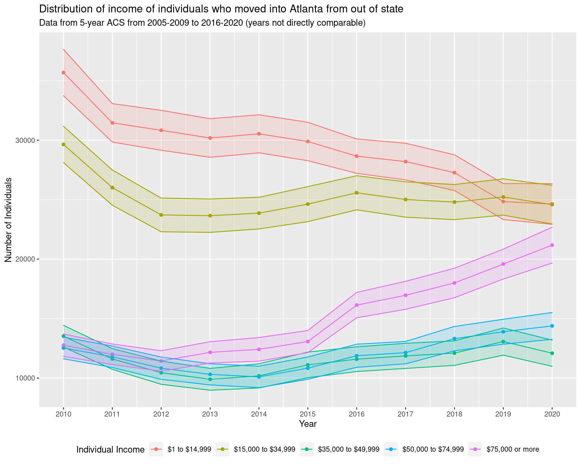
# df_income_change_corr <- df_income_tracts %>%
#     filter(variable != "Total") %>%
#     select(year, GEOID, variable, estimate, moe) %>%
#     mutate(variable = fct_collapse(variable,
#         "Less than $75,000" = c(
#             "Less than $10,000", "$10,000 to $14,999",
#             "$15,000 to $19,999", "$20,000 to $24,999",
#             "$25,000 to $29,999", "$30,000 to $34,999",
#             "$35,000 to $39,999", "$40,000 to $44,999",
#             "$45,000 to $49,999", "$50,000 to $59,999",
#             "$60,000 to $74,999"
#         ),
#         "$75,000 to $99,999" = c("$75,000 to $99,999"),
#         "$100,000 to $149,999" = c(
#             "$100,000 to $124,999", "$125,000 to $149,999"
#         ),
#         "$150,000 or more" = c(
#             "$150,000 to $199,999", "$200,000 or more"
#             )
#     )) %>%
#     mutate(
#         variable = factor(
#             variable, ordered = TRUE,
#             levels = c(
#                 "Less than $75,000", "$75,000 to $99,999",
#                 "$100,000 to $149,999", "$150,000 or more"
#             )
#         )
#     ) %>%
#     group_by(year, GEOID, variable) %>%
#     summarize(
#         estimate = sum(estimate),
#         moe = sqrt(sum(moe**2))
#     ) %>%
#     ungroup() %>%
#     pivot_wider(
#         names_from = "year",
#         values_from = c("estimate", "moe")
#     ) %>%
#     mutate(
#         change = estimate_2019 - estimate_2010,
#         ratio = estimate_2019 / estimate_2010,
#         log_ratio_moe = sqrt((moe_2019/estimate_2019)**2 + (moe_2010/estimate_2010)**2)
#     ) %>%
#     left_join(df_tracts) %>%
#     select(GEOID, variable, ratio, log_ratio_moe) %>%
#     filter(variable %in% c("Less than $75,000", "$150,000 or more")) %>%
#     mutate(variable = fct_recode(
#         variable, "lt_75k" = "Less than $75,000", "gt_150k" = "$150,000 or more"
#     )) %>%
#     pivot_wider(
#         names_from = variable,
#         values_from = c("ratio", "log_ratio_moe")
#     )

# require(deming)

# dr <- deming(
#     log(ratio_lt_75k) ~ log(ratio_gt_150k),
#     data = df_income_change_corr %>% filter(
#         ratio_gt_150k < 20, ratio_gt_150k > 0.01
#     ),
#     ystd = log_ratio_moe_lt_75k, xstd = log_ratio_moe_gt_150k
# )
# dr
3.1 Change in number of households earning less than $75,000 in Atlanta and the surrounding area
In order to try and examine more carefully where people in the lower income band are moving, we look at the change in households over the entire Atlanta Metropoliton Statistical Area in the $75,000 or less income bracket. We note that this roughly corresponds to the current living wage) estimate for a household in Atlanta, assuming a two adult household with two children and one adult working.
df_tracts_msa <- map_dfr(
    lst(2010),
    ~ get_acs(
        geography = "tract",
        state = "GA",
        variables = "B19001_001",
        year = .x,
        county = atlanta_msa,
        survey = "acs5",
        geometry = TRUE
    ),
    .id = "year") %>%
    select(GEOID, geometry) %>%
    mutate(
        tp = st_intersects(
            st_transform(st_boundary(itp), crs = 4269),
            geometry, sparse = FALSE
        )[1, ],
        itp = st_within(
            geometry,
            st_transform(itp, crs = 4269), sparse = FALSE
        )[, 1],
        itp = tp | itp,
        otp = !itp
    ) %>% select(-tp) %>%
    pivot_longer(
        cols = c(itp, otp),
        names_to = "class",
        values_to = "in_class"
    ) %>%
    filter(in_class == TRUE) %>%
    select(-in_class)

df_income_tracts_msa <- map_dfr(
    lst(2010, 2019),
    ~ get_acs(
        geography = "tract",
        state = "GA",
        variables = income_var_list,
        year = .x,
        county = atlanta_msa,
        survey = "acs5",
        geometry = FALSE
    ),
    .id = "year") %>%
    mutate(
        tract = gsub("^(.*?),.*", "\\1", NAME),
        county = gsub("^(.*?), (.*?),.*", "\\2", NAME)
    ) %>%
    select(-NAME) %>%
    relocate(tract, county, .after = GEOID) %>%
    filter(variable != "Total") %>%
    select(year, GEOID, variable, estimate) %>%
    mutate(variable = fct_collapse(variable,
        "Less than $50,000" = c(
            "Less than $10,000", "$10,000 to $14,999",
            "$15,000 to $19,999", "$20,000 to $24,999",
            "$25,000 to $29,999", "$30,000 to $34,999",
            "$35,000 to $39,999", "$40,000 to $44,999",
            "$45,000 to $49,999"
        ),
        "$50,000 to $74,999" = c("$50,000 to $59,999", "$60,000 to $74,999"),
        "$75,000 to $99,999" = c("$75,000 to $99,999"),
        "$100,000 to $149,999" = c(
            "$100,000 to $124,999", "$125,000 to $149,999"
        ),
        "$150,000 to $199,999" = c("$150,000 to $199,999"),
        "$200,000 or more" = c("$200,000 or more")
    )) %>%
    mutate(
        variable = factor(variable, ordered = TRUE, levels = income_var_labels)
    ) %>%
    group_by(year, GEOID, variable) %>%
    summarize(estimate = sum(estimate)) %>%
    pivot_wider(
        names_from = "year",
        names_prefix = "estimate_",
        values_from = "estimate"
    ) %>%
    mutate(change = estimate_2019 - estimate_2010) %>%
    left_join(df_tracts_msa)

p_wider <- ggplot() +
    geom_sf(
        data = df_income_tracts_msa %>%
        filter(variable == "Less than $50,000") %>%
        mutate(change = pminmax(change, -500, 500)),
        aes(geometry = geometry, fill = change),
        colour = "grey", lwd = 0.25
    ) + scale_fill_viridis(
        option = "turbo",
        labels = c("<= -500", -250, 0, 250, "500 <=")
    ) + geom_sf(data = atlanta_msa_shp, colour = "black", fill = NA) +
    geom_sf(data = highway_arc_msa, colour = "black", lty = 3, fill = NA) +
    theme(legend.position = "bottom") +
    labs(
        fill = "Change in number of households earning less than $50,000",
        title = "Change in number of households in income band by tract",
        subtitle = "(Data using 5-year estimates from the 2006-2010 ACS and 2015-2019 ACS)"
    ) +
    theme(legend.key.width = unit(2, 'cm'))

p_wider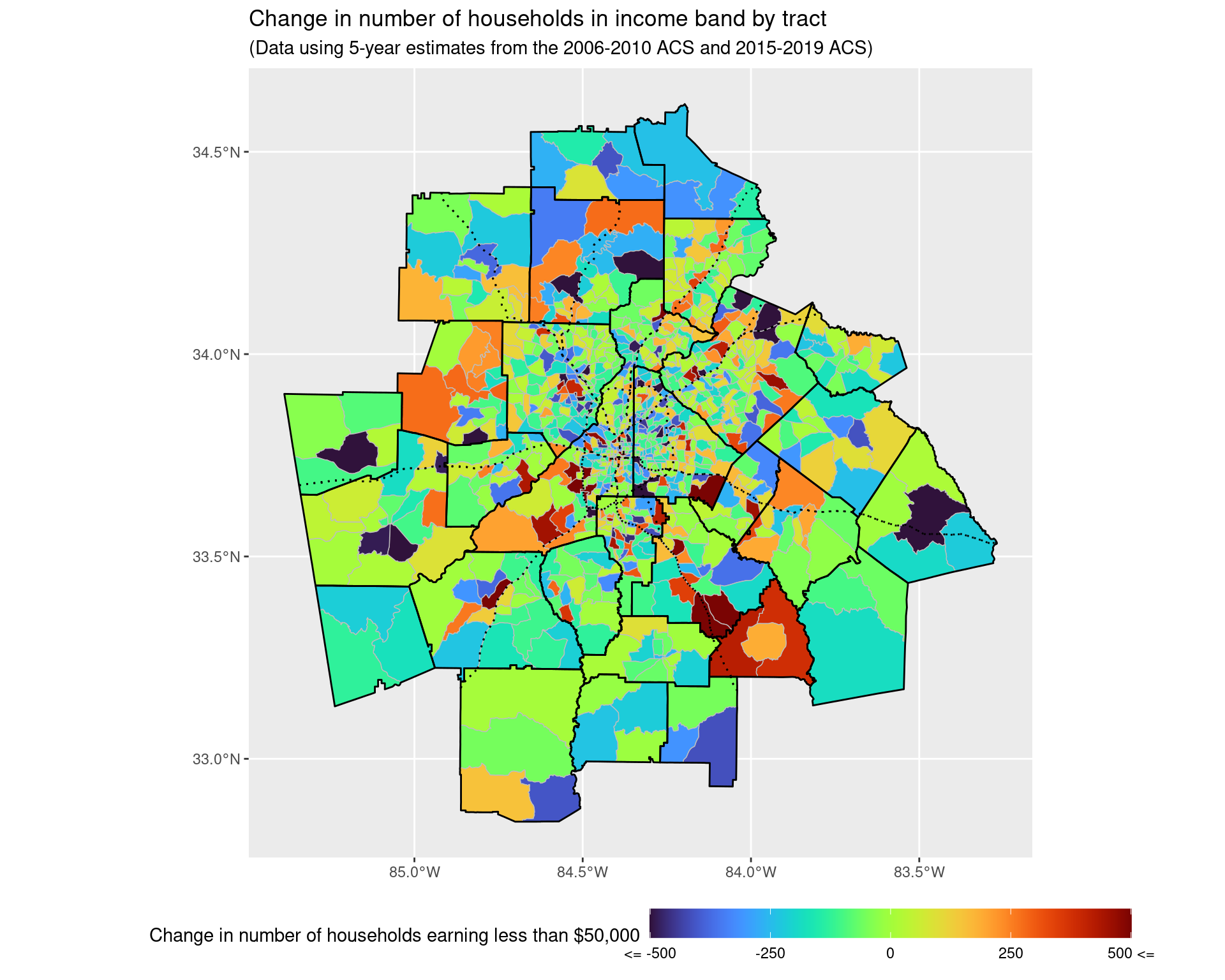
4 How has the amount of rent changed in the Atlanta area from 2010 to 2020?
From the data and graph below, we can see that prior to the recession, the majority of the amount paid per month in rent was less than $1,249 a month, whereas now a considerable number of units require at least this much to pay. That said, this is not accounting directly for changes in inflation; however, when looking at the median and lower quartile monthly rent, these are typically around 20% and 10% higher than what they were ten years ago, even when adjusting for inflation. The same occurs in most of the counties for the upper quartile of monthly rent.
v20 <- load_variables(2020, "acs5", cache = TRUE)

rent_variables_2010 <- paste0("B25063_0", str_pad(1:24, 2, pad = "0"))

rent_var_labels_2010 <- v11 %>%
    filter(name %in% rent_variables_2010) %>%
    select(label) %>% as_vector()

rent_var_labels_2010 <- sapply(
    str_split(rent_var_labels_2010, "!!"), tail, 1
)

rent_var_list_2010 <- setNames(
    as.list(rent_variables_2010), rent_var_labels_2010
)

df_rent_distribution_2010 <- map_dfr(
    lst(2010),
    ~ get_acs(
        geography = "county",
        state = "GA",
        variables = rent_var_list_2010,
        year = .x,
        county = arc_counties,
        survey = "acs5",
        geometry = FALSE
    ),
    .id = "year") %>%
    mutate(
        county = gsub("^(.*?),.*", "\\1", NAME)
    ) %>% select(-NAME) %>% relocate(county, .after = GEOID)

rent_variables_2020 <- paste0("B25063_0", str_pad(1:27, 2, pad = "0"))

rent_var_labels_2020 <- v20 %>%
    filter(name %in% rent_variables_2020) %>%
    select(label) %>% as_vector()

rent_var_labels_2020 <- sapply(
    str_split(rent_var_labels_2020, "!!"), tail, 1
)

rent_var_list_2020 <- setNames(
    as.list(rent_variables_2020), rent_var_labels_2020
)

df_rent_distribution_2020 <- map_dfr(
    lst(2020),
    ~ get_acs(
        geography = "county",
        state = "GA",
        variables = rent_var_list_2020,
        year = .x,
        county = arc_counties,
        survey = "acs5",
        geometry = FALSE
    ),
    .id = "year") %>%
    mutate(
        county = gsub("^(.*?),.*", "\\1", NAME)
    ) %>% select(-NAME) %>% relocate(county, .after = GEOID)

df_rent_distribution <- bind_rows(
    df_rent_distribution_2010, df_rent_distribution_2020
)

collapsed_factors <- c(
    "Less than $750", "$750 to $999", "$1,000 to $1,249",
    "$1,250 to $1,499", "$1,500 to $1,999", "$2,000 or more"
)

df_rent_dist_summary <- df_rent_distribution %>%
    mutate(variable = fct_collapse(
    variable,
    "Less than $750" = c(
        "Less than $100", "$100 to $149", "$150 to $199", "$200 to $249",
        "$250 to $299", "$300 to $349", "$350 to $399",
        "$400 to $449", "$450 to $499", "$500 to $549",
        "$550 to $599", "$600 to $649", "$650 to $699",
        "$700 to $749"
    ),
    "$750 to $999" = c(
        "$750 to $799", "$800 to $899", "$900 to $999"
    ),
    "$1,000 to $1,249" = c(
        "$1,000 to $1,249"
    ),
    "$1,250 to $1,499" = c(
        "$1,250 to $1,499"
    ),
    "$1,500 to $1,999" = c(
        "$1,500 to $1,999"
    ),
    "$2,000 or more" = c(
        "$2,000 or more", "$2,000 to $2,499",
        "$2,500 to $2,999", "$3,000 to $3,499",
        "$3,500 or more"
    )
)) %>% group_by(year, variable) %>%
    summarize(
        estimate = sum(estimate), moe = sqrt(sum(moe**2))
    ) %>%
    filter(variable %in% collapsed_factors) %>%
    mutate(
        variable = factor(variable,
            ordered = "true", levels = collapsed_factors)
        )

df_rent_dist_summary
df_rent_dist_summary %>%
ggplot(aes(x = variable, y = estimate, fill = year)) +
geom_col(position = "dodge") +
geom_errorbar(
aes(ymin = estimate - moe, ymax = estimate + moe),
position = "dodge"
) + scale_fill_manual(values = cbPalette) +
geom_text(
aes(label = year, y = 10000),
position = position_dodge(width = 1),
size = 5, hjust = 'left',
col = "black"
) +
labs(
x = "Gross Rent", y = "Number of renter-occupied housing units", fill = "Year",
title = "Distribution of monthly gross rent in the Atlanta area from 2010 to 2019",
subtitle = "Data from the 5-year ACS from 2006-2010 to 2016-2020"
) +
coord_flip() +
theme(legend.position = "none")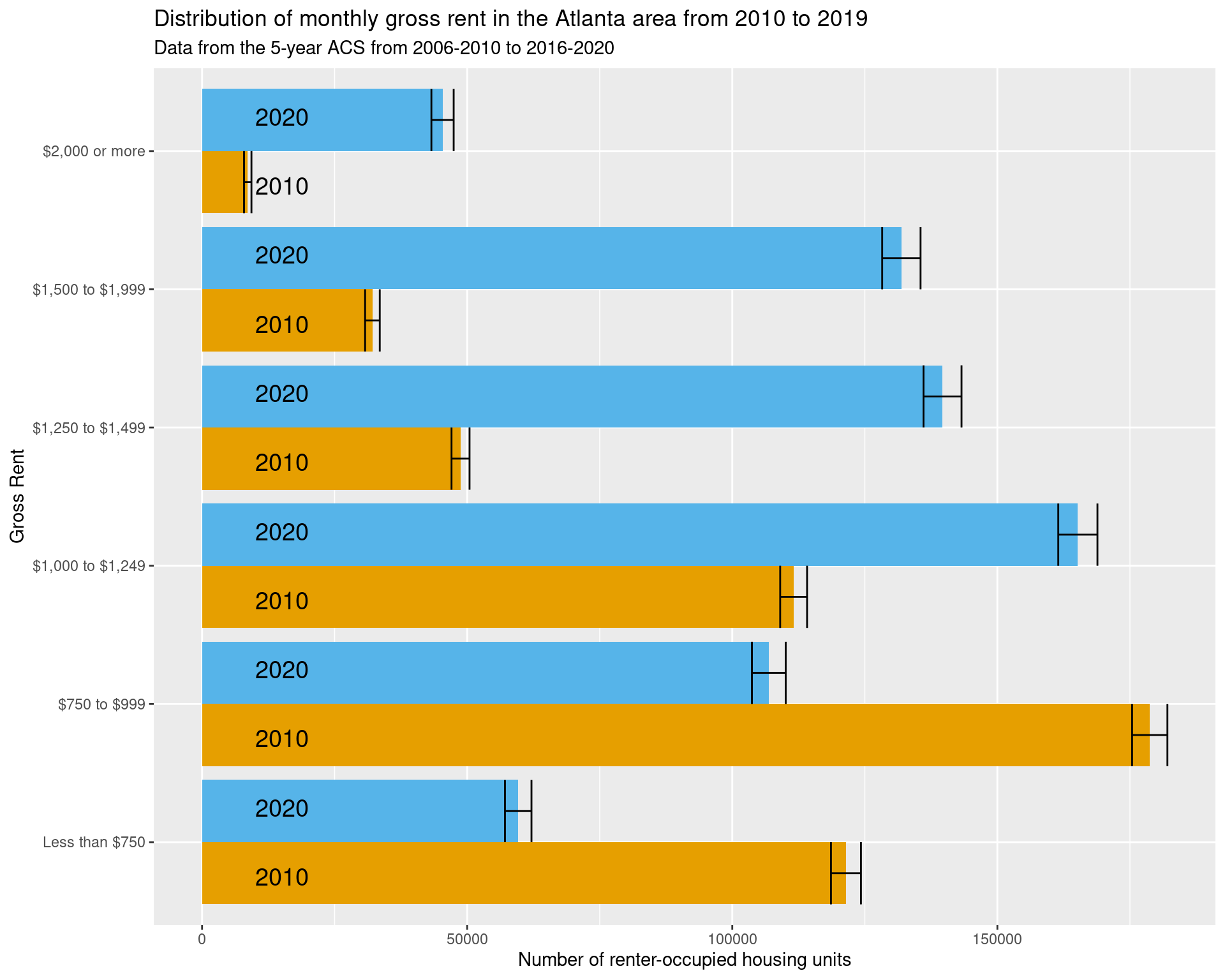
df_rent_lower_quartile <- map_dfr(
    lst(2010, 2020),
    ~ get_acs(
        geography = "county",
        state = "GA",
        variables = "B25057_001",
        year = .x,
        county = arc_counties,
        survey = "acs5",
        geometry = FALSE
    ),
    .id = "year") %>%
    mutate(
        county = gsub("^(.*?),.*", "\\1", NAME)
    ) %>% select(-NAME) %>% relocate(county, .after = GEOID) %>%
    select(county, year, estimate) %>%
    pivot_wider(
        names_from = year, values_from = estimate,
        names_prefix = "rent_"
    ) %>%
    mutate(
        rent_2010_in_2020_dollars = rent_2010 * 1.19,
        ratio_adjusting_for_inflation = rent_2020 / (rent_2010 * 1.19)
    )

df_rent_lower_quartile
df_rent_median_quartile <- map_dfr(
lst(2010, 2020),
~ get_acs(
geography = "county",
state = "GA",
variables = "B25058_001",
year = .x,
county = arc_counties,
survey = "acs5",
geometry = FALSE
),
.id = "year") %>%
mutate(
county = gsub("^(.*?),.*", "\\1", NAME)
) %>% select(-NAME) %>% relocate(county, .after = GEOID) %>%
select(county, year, estimate) %>%
pivot_wider(
names_from = year, values_from = estimate,
names_prefix = "rent_"
) %>%
mutate(
rent_2010_in_2020_dollars = rent_2010 * 1.19,
ratio_adjusting_for_inflation = rent_2020 / (rent_2010 * 1.19)
)
df_rent_median_quartiledf_rent_upper_quartile <- map_dfr(
lst(2010, 2020),
~ get_acs(
geography = "county",
state = "GA",
variables = "B25059_001",
year = .x,
county = arc_counties,
survey = "acs5",
geometry = FALSE
),
.id = "year") %>%
mutate(
county = gsub("^(.*?),.*", "\\1", NAME)
) %>%
select(-NAME) %>%
relocate(county, .after = GEOID) %>%
select(county, year, estimate) %>%
pivot_wider(
names_from = year, values_from = estimate,
names_prefix = "rent_"
) %>%
mutate(
rent_2010_in_2020_dollars = rent_2010 * 1.19,
ratio_adjusting_for_inflation = rent_2020 / (rent_2010 * 1.19)
)
df_rent_upper_quartile4.1 Examining quintiles of earnings
df_income_quintiles <- map_dfr(
lst(2010, 2019),
~ get_acs(
geography = "tract",
state = "GA",
variables = c(
first_qui = "B19080_001",
second_qui = "B19080_002",
third_qui = "B19080_003",
fourth_qui = "B19080_004",
top_5per = "B19080_005"
),
year = .x,
county = arc_counties,
survey = "acs5",
geometry = FALSE
),
.id = "year") %>% mutate(
tract = gsub("^(.*?),.*", "\\1", NAME),
county = gsub("^(.*?), (.*?),.*", "\\2", NAME)
) %>%
select(-NAME) %>%
relocate(tract, county, .after = GEOID) %>%
select(year, GEOID, variable, estimate, moe) %>%
mutate(
inflation_factor = ifelse(year == "2019", 1, 1.175),
estimate = estimate * inflation_factor,
moe = moe * inflation_factor
) %>%
select(-inflation_factor)
df_income_quintiles_change <- df_income_quintiles %>%
filter(variable %in% c("first_qui", "top_5per")) %>%
pivot_wider(
names_from = year,
values_from = c(estimate, moe)
) %>%
mutate(
estimate_diff = estimate_2019 - estimate_2010,
moe_diff = sqrt(moe_2019**2 + moe_2010**2)
) %>%
select(GEOID, variable, estimate_diff, moe_diff) %>%
pivot_wider(
names_from = variable,
values_from = c(estimate_diff, moe_diff)
)
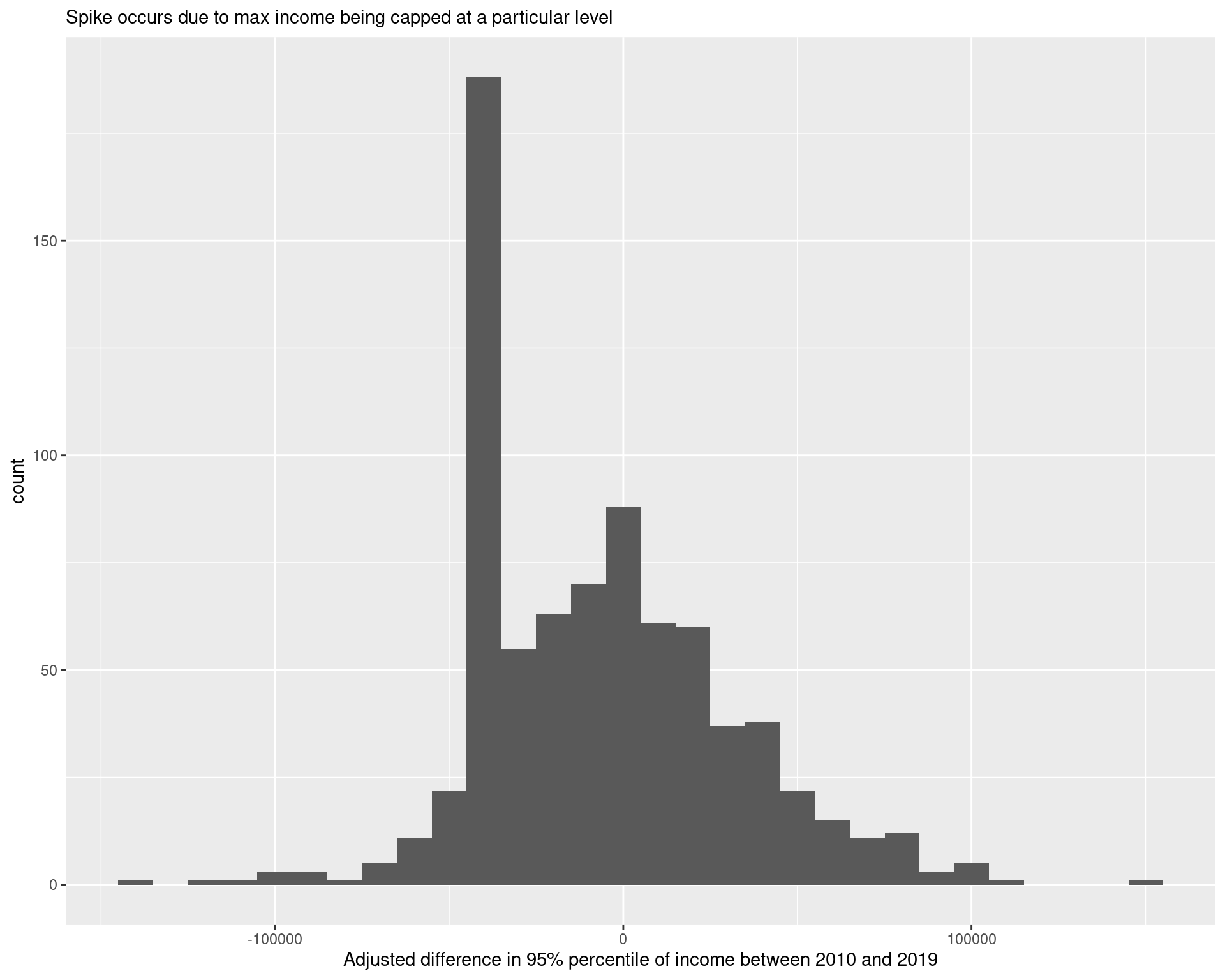
df_income_quintiles_change %>%
ggplot(aes(x = estimate_diff_top_5per)) +
geom_histogram() +
labs(
x = "Adjusted difference in 95% percentile of income between 2010 and 2019",
subtitle = "Spike occurs due to max income being capped at a particular level"
)
4.2 Examining measures of income inequality
The Gini coefficient is a measure of income inequality frequently used, giving a number between 0 and 1 (with larger values corresponding to greater inequality). We examine the change in the estimate Gini coefficient in each census tract, comparing the periods between 2006-2010 and 2015-2019, and when doing so, we find that there has been a statistically significant increase in the Gini coefficient generally across tracts, with the Gini coefficient increasing on average by 0.014 across tracts.
df_gini <- map_dfr(
    lst(2010, 2019),
    ~ get_acs(
        geography = "tract",
        state = "GA",
        variables = c(
            gini = "B19083_001"
        ),
        year = .x,
        county = arc_counties,
        survey = "acs5",
        geometry = FALSE
    ),
    .id = "year") %>% mutate(
        tract = gsub("^(.*?),.*", "\\1", NAME),
        county = gsub("^(.*?), (.*?),.*", "\\2", NAME)
    ) %>%
    select(-NAME) %>%
    relocate(tract, county, .after = GEOID) %>%
    select(year, GEOID, estimate, moe)

df_gini_wide <- df_gini %>%
    pivot_wider(
        values_from = c(estimate, moe),
        names_from = year,
        names_prefix = "gini_",
        names_sep = "_"
    ) %>%
    mutate(
        diff = estimate_gini_2019 - estimate_gini_2010,
        diff_moe = sqrt(moe_gini_2019**2 + moe_gini_2010**2),
        diff_sd = diff_moe / 1.645,
        z_score = diff / diff_sd,
        ratio = estimate_gini_2019 / estimate_gini_2010,
        log_ratio_moe = sqrt( (moe_gini_2010 / estimate_gini_2010)**2 + (moe_gini_2019 / estimate_gini_2019)**2  ),
        log_ratio_sd = log_ratio_moe / 1.645
    )

mean_est <- mean(df_gini_wide$diff, na.rm = TRUE)
sd1 <- sd(df_gini_wide$diff, na.rm = TRUE)
sd2 <- sqrt(mean(df_gini_wide$diff_sd**2, na.rm = TRUE))
samp_n <- sum(!is.na(df_gini_wide$diff))

t_stat <- sqrt(samp_n)*mean_est/sqrt(sd1**2 + sd2**2)
p_val <- pt(t_stat, df = samp_n, lower.tail = FALSE)
print(paste("p-value of hypothesis test:", p_val))
## [1] "p-value of hypothesis test: 0.000000173458002202825"ggplot() +
geom_sf(
data = df_tracts %>% left_join(df_gini_wide),
aes(geometry = geometry, fill = estimate_gini_2019),
colour = "grey", lwd = 0.25
) + scale_fill_viridis(
option = "magma"
) +
geom_sf(data = arc_counties_shp, colour = "black", fill = NA) +
geom_sf(data = highway_arc, colour = "black", lty = 3, fill = NA) +
theme(legend.position = "bottom") +
labs(
fill = "Gini coefficient",
title = "Gini coefficient estimates over 2015-2019 across Atlanta",
subtitle = "(Data using ACS 2015-2019 estimates)"
) +
theme(legend.key.width = unit(2, 'cm'))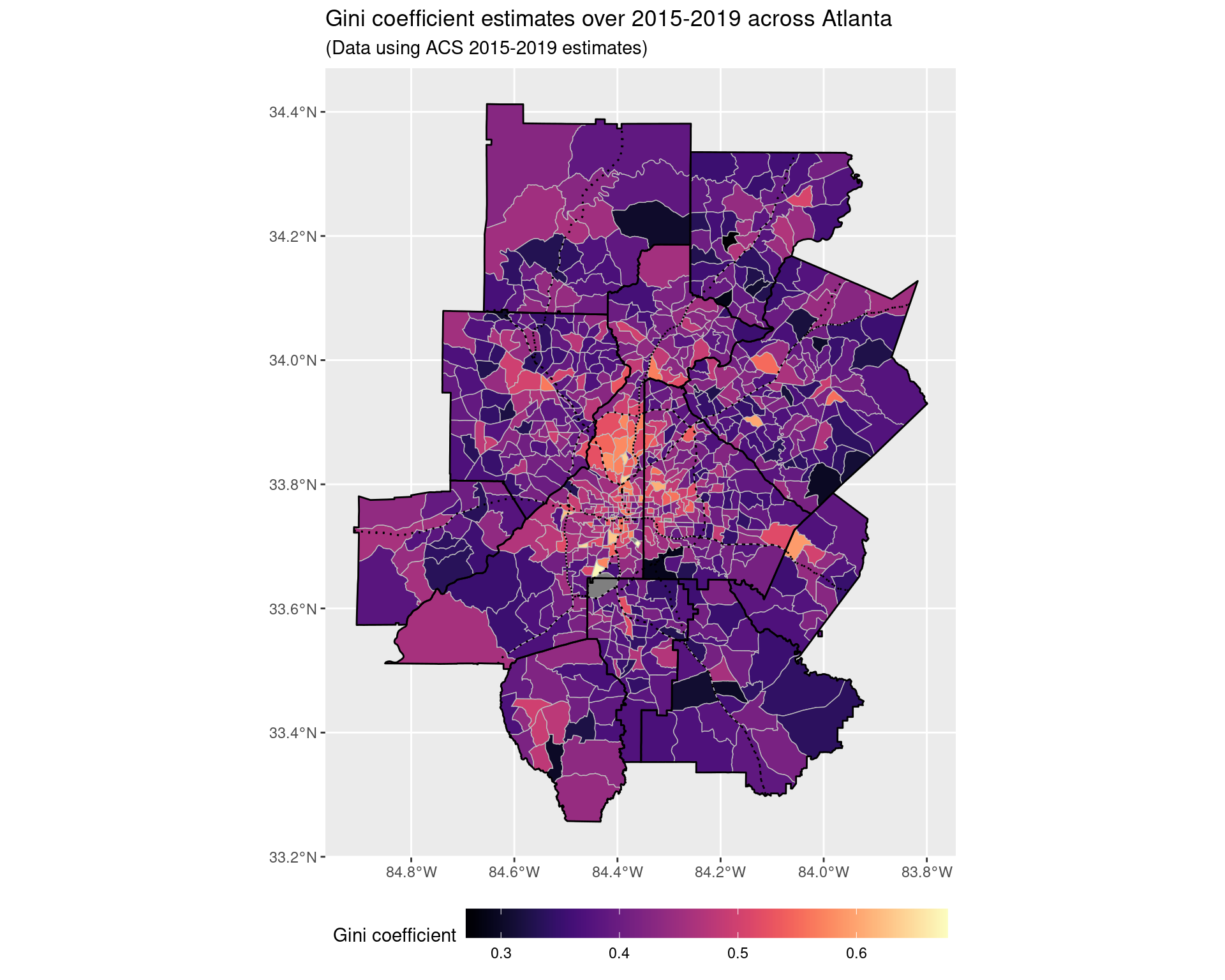
5 Incorporating land-use change data
5.1 Change from 2008 to 2019
land_use_labels <- read_csv("data-files/ncld_class_labels.csv") %>%
    select(layer_vals, labels) %>%
    add_row(layer_vals = 0, labels = "Roads")

land_use_labels %>% print(n = Inf)
## # A tibble: 21 × 2
## layer_vals labels
## <dbl> <chr>
## 1 11 Open water
## 2 12 Perennial ice/snow
## 3 21 Developed, open space
## 4 22 Developed, low intensity
## 5 23 Developed, medium intensity
## 6 24 Developed high intensity
## 7 31 Barren land (rock/sand/clay)
## 8 41 Deciduous forest
## 9 42 Evergreen forest
## 10 43 Mixed forest
## 11 51 Dwarf scrub
## 12 52 Shrub/scrub
## 13 71 Grassland/herbaceous
## 14 72 Sedge/herbaceous
## 15 73 Lichens
## 16 74 Moss
## 17 81 Pasture/hay
## 18 82 Cultivated crops
## 19 90 Woody wetlands
## 20 95 Emergent herbaceous wetlands
## 21 0 Roadsland_use_df <- read_csv("data-files/ncld_histogram_data.csv")
land_use_df <- land_use_df %>%
complete(GEOID, year, class) %>%
mutate(value = replace_na(value, 0))
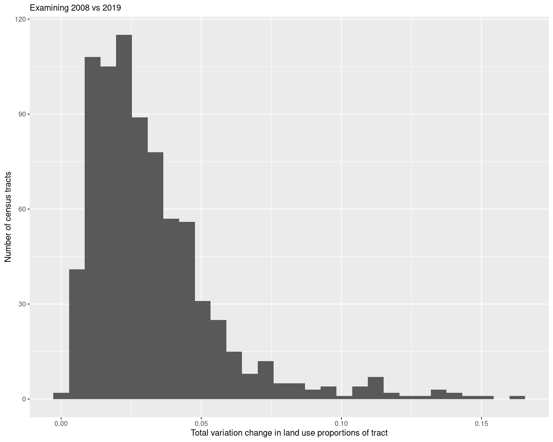
land_use_change <- land_use_df %>%
filter(year %in% c(2008, 2019)) %>%
group_by(GEOID, year) %>%
mutate(value = value / sum(value)) %>%
ungroup() %>%
pivot_wider(
names_from = year,
values_from = value,
names_prefix = "value_"
) %>%
mutate(abs_diff = abs(value_2019 - value_2008)) %>%
group_by(GEOID) %>%
summarize(tv_dist = 0.5*sum(abs_diff))
land_use_change %>%
ggplot(aes(x = tv_dist)) + geom_histogram() +
labs(
x = "Total variation change in land use proportions of tract",
y = "Number of census tracts",
subtitle = "Examining 2008 vs 2019"
)
land_use_change_shp <- land_use_change %>%
    mutate(GEOID = as.character(GEOID)) %>%
    left_join(df_tracts)

land_use_plot <- ggplot() +
    geom_sf(
        data = land_use_change_shp %>%
        mutate(tv_dist = pminmax(tv_dist, 0, 0.05)),
        aes(geometry = geometry, fill = tv_dist),
        colour = "grey", lwd = 0.25
    ) + scale_fill_viridis(
        option = "viridis",
        labels = c("0", "0.01", "0.02", "0.03", "0.04", "0.05+")
    ) +
    geom_sf(data = arc_counties_shp, colour = "black", fill = NA) +
    geom_sf(data = highway_arc, colour = "black", lty = 3, fill = NA) +
    theme(legend.position = "bottom") +
    labs(
        fill = "Overall change in land type",
        title = "Total variation between type of land use between 2008 and 2019",
        subtitle = "(Data using NCLD National Land Cover Database)"
    ) +
    theme(legend.key.width = unit(2, 'cm'))

land_use_plot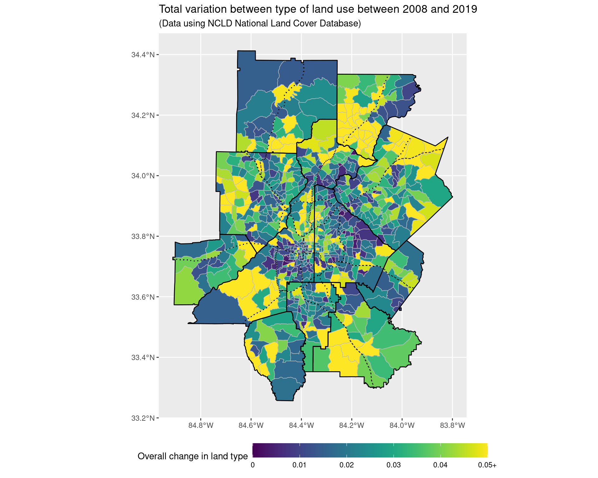
ggsave("img-files/land_use_change.pdf")

land_use_plot_outliers <- ggplot() +
    geom_sf(
        data = land_use_change_shp,
        aes(geometry = geometry, fill = tv_dist),
        colour = "grey", lwd = 0.25
    ) + scale_fill_viridis(
        option = "viridis"
    ) +
    geom_sf(data = arc_counties_shp, colour = "black", fill = NA) +
    geom_sf(data = highway_arc, colour = "black", lty = 3, fill = NA) +
    theme(legend.position = "bottom") +
    labs(
        fill = "Overall change in land type\n(Not truncated)",
        title = "Total variation between type of land use between 2008 and 2019",
        subtitle = "(Data using NCLD National Land Cover Database)"
    ) +
    theme(legend.key.width = unit(2, 'cm'))

land_use_plot_outliers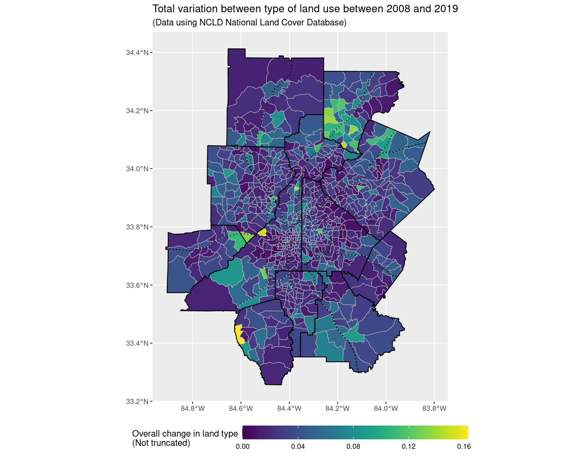
land_use_plot +
    coord_sf(xlim = c(-84.53, -84.2), ylim = c(33.6, 33.95), expand = FALSE)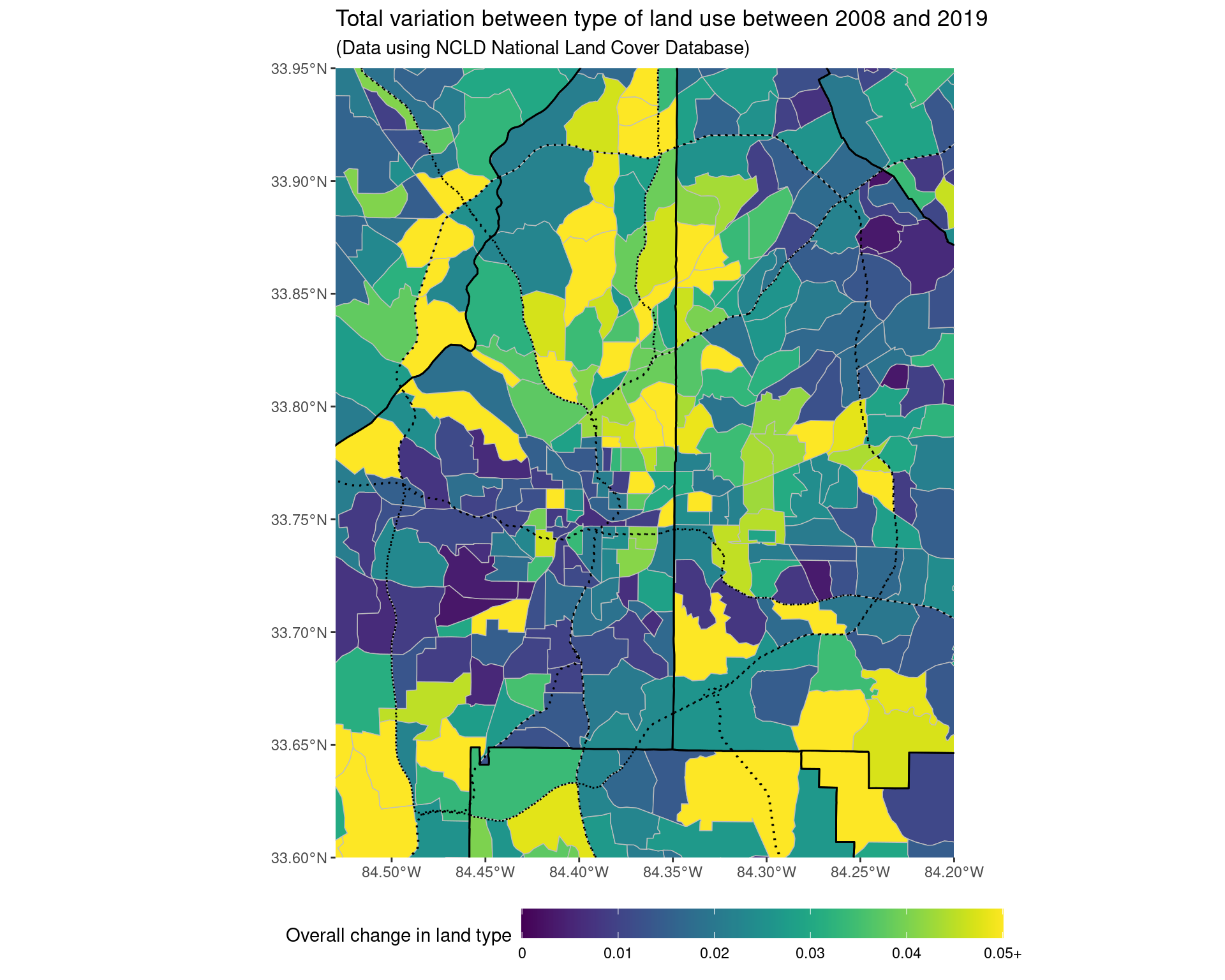
ggsave("img-files/land_use_change_itp.pdf")5.2 Change from 2001 to 2019
land_use_change_2001 <- land_use_df %>%
filter(year %in% c(2001, 2019)) %>%
group_by(GEOID, year) %>%
mutate(value = value / sum(value)) %>%
ungroup() %>%
pivot_wider(
names_from = year,
values_from = value,
names_prefix = "value_"
) %>%
mutate(abs_diff = abs(value_2019 - value_2001)) %>%
group_by(GEOID) %>%
summarize(tv_dist = 0.5 * sum(abs_diff))
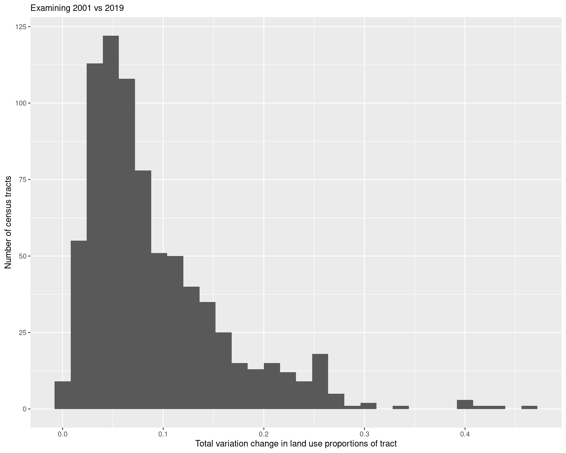
land_use_change_2001 %>%
ggplot(aes(x = tv_dist)) + geom_histogram() +
labs(
x = "Total variation change in land use proportions of tract",
y = "Number of census tracts",
subtitle = "Examining 2001 vs 2019"
)
land_use_change_shp_2001 <- land_use_change_2001 %>%
    mutate(GEOID = as.character(GEOID)) %>%
    left_join(df_tracts)

land_use_plot <- ggplot() +
    geom_sf(
        data = land_use_change_shp_2001 %>%
        mutate(tv_dist = pminmax(tv_dist, 0, 0.15)),
        aes(geometry = geometry, fill = tv_dist),
        colour = "grey", lwd = 0.25
    ) + scale_fill_viridis(
        option = "viridis",
        labels = c("0", "0.05", "0.10", "0.15+")
    ) +
    geom_sf(data = arc_counties_shp, colour = "black", fill = NA) +
    geom_sf(data = highway_arc, colour = "black", lty = 3, fill = NA) +
    theme(legend.position = "bottom") +
    labs(
        fill = "Overall change in land type",
        title = "Total variation between type of land use between 2001 and 2019",
        subtitle = "(Data using NCLD National Land Cover Database)"
    ) +
    theme(legend.key.width = unit(2, 'cm'))

land_use_plot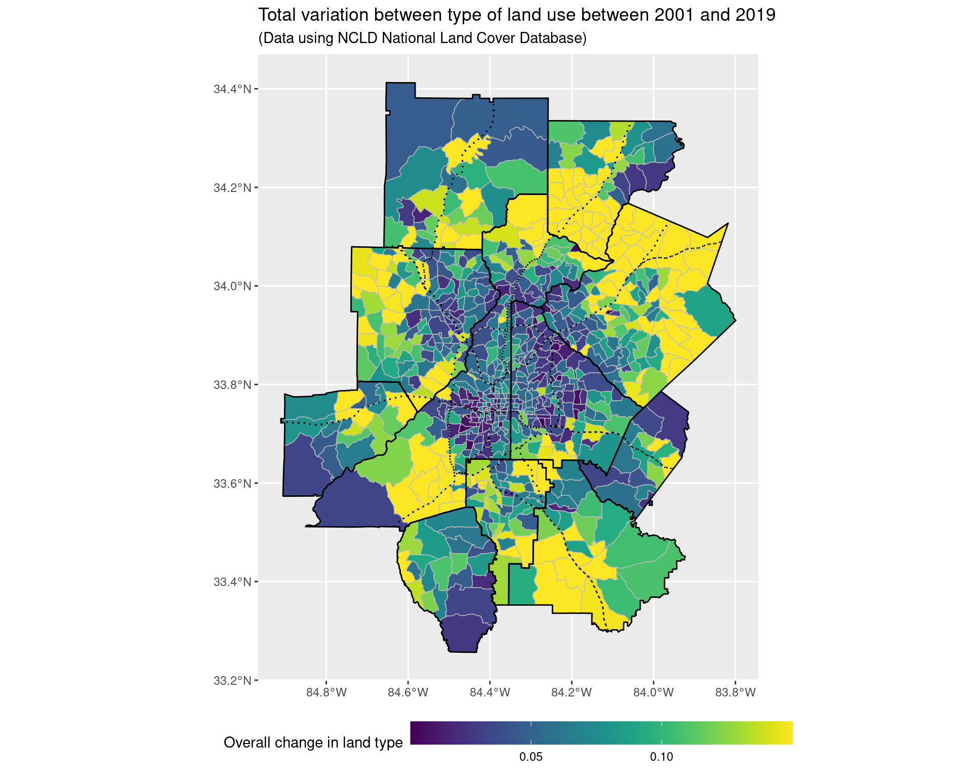
ggsave("img-files/land_use_change_2001.pdf")

land_use_plot_outliers <- ggplot() +
    geom_sf(
        data = land_use_change_shp_2001,
        aes(geometry = geometry, fill = pminmax(tv_dist, 0, 0.3)),
        colour = "grey", lwd = 0.25
    ) + scale_fill_viridis(
        option = "viridis"
    ) +
    geom_sf(data = arc_counties_shp, colour = "black", fill = NA) +
    geom_sf(data = highway_arc, colour = "black", lty = 3, fill = NA) +
    theme(legend.position = "bottom") +
    labs(
        fill = "Overall change in land type\n(Truncated at 0.3)",
        title = "Total variation between type of land use between 2001 and 2019",
        subtitle = "(Data using NCLD National Land Cover Database)"
    ) +
    theme(legend.key.width = unit(2, 'cm'))

land_use_plot_outliers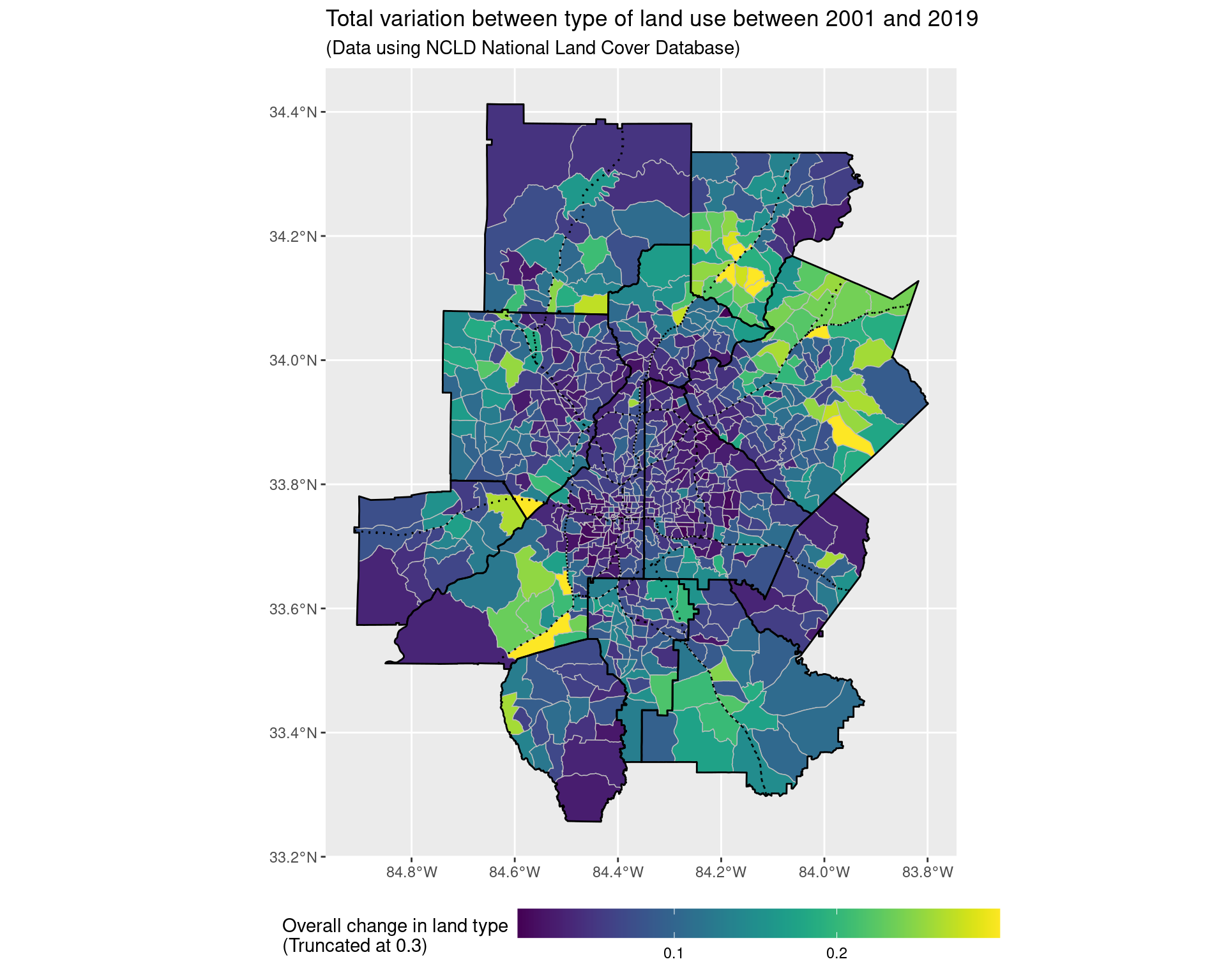
land_use_plot +
    coord_sf(xlim = c(-84.53, -84.2), ylim = c(33.6, 33.95), expand = FALSE)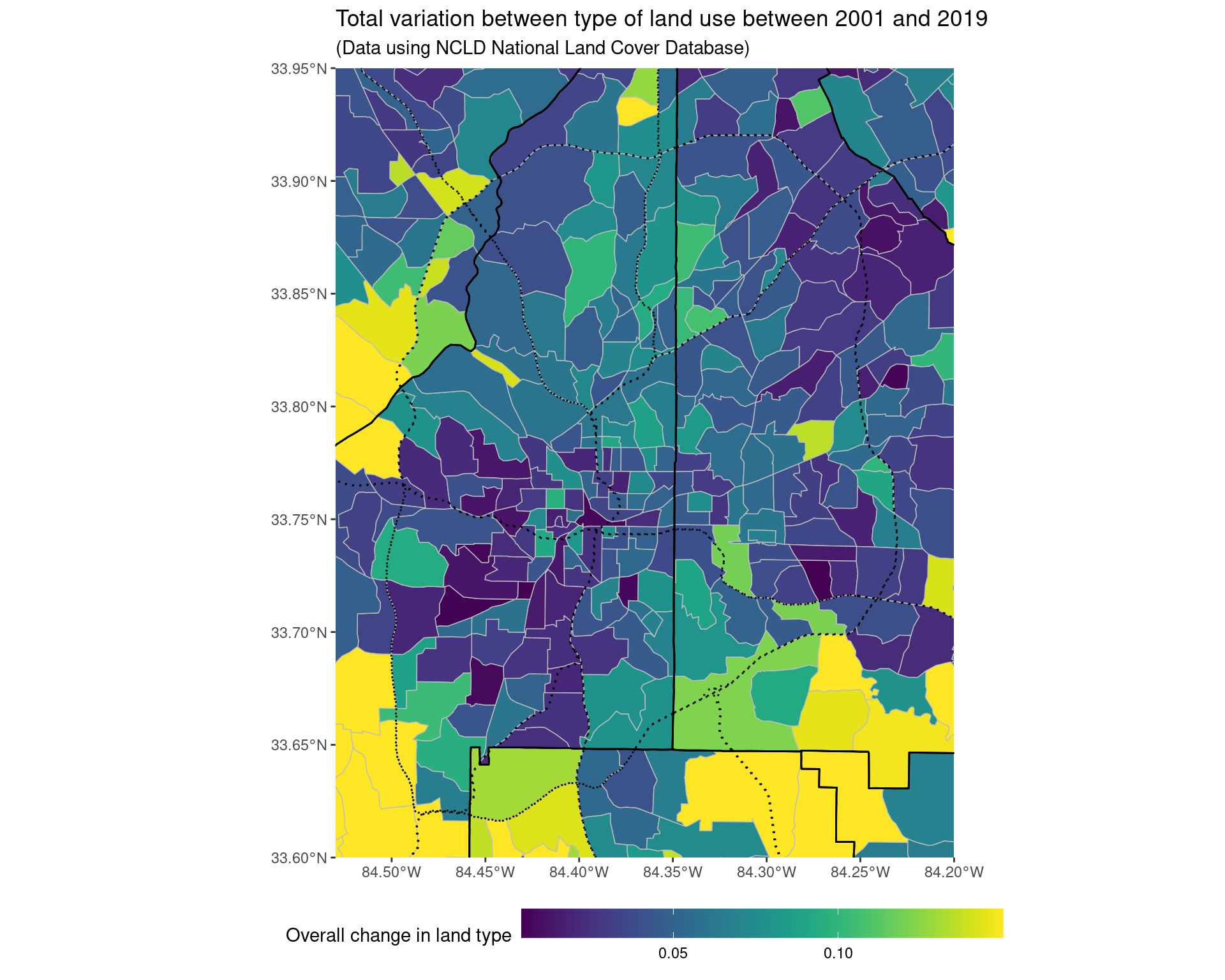
ggsave("img-files/land_use_change_itp_2001.pdf")5.3 Looking at reduced classes (merging together the non-developed types into one category)
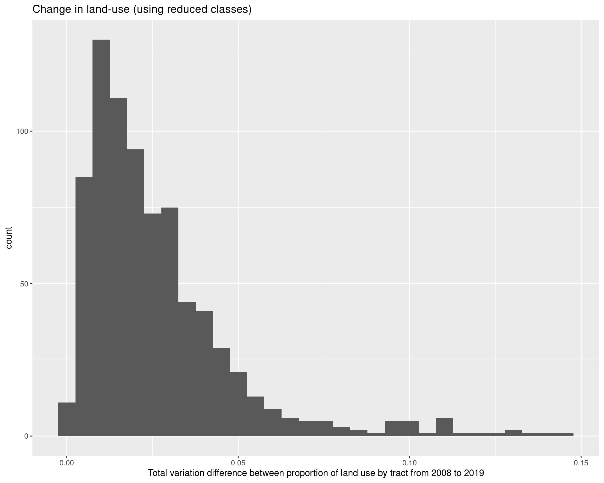
As we can see, looking at the most frequent “class” (i.e, the way in which the land has been used the most) tends to not change much across the two time periods, although there has been a growth in the more developed areas.
land_use_df_summary <- land_use_df %>%
    mutate(class = fct_collapse(
        factor(class), "Roads" = "0",
        "Developed, open space" = "21",
        "Developed, low intensity" = "22",
        "Developed, medium intensity" = "23",
        "Developed, high intensity" = "24",
        "Undeveloped / greenland" = c(
            "11", "12", "31", "41", "42",
            "43", "51", "52", "71", "72", "73", "74",
            "81", "82", "90", "95"
        )
    )) %>%
    group_by(GEOID, year, class) %>%
    summarize(value = sum(value)) %>%
    filter(year %in% c(2008, 2019)) %>%
    group_by(GEOID, year) %>%
    mutate(value = value / sum(value))

land_use_df_summary %>%
    pivot_wider(
        names_from = year,
        values_from = value,
        names_prefix = "value_"
    ) %>%
    mutate(value_diff = value_2019 - value_2008) %>%
    group_by(GEOID) %>%
    summarize(tv_diff = 0.5*sum(abs(value_diff))) %>%
    ggplot(aes(x = tv_diff)) + geom_histogram() +
    labs(
        x = "Total variation difference between proportion of land use by tract from 2008 to 2019",
        title = "Change in land-use (using reduced classes)"
    )
land_use_df_summary %>%
    group_by(GEOID, year) %>%
    mutate(max_value = max(value)) %>%
    ungroup() %>%
    filter(value == max_value) %>%
    select(year, class) %>%
    group_by(year, class) %>%
    summarize(count = n()) %>%
    pivot_wider(
        values_from = count,
        names_from = year
    )
We can also see that both inside and outside of the perimeter, there is generally a trend towards more developed areas.
land_use_df %>%
    mutate(class = fct_collapse(
        factor(class), "Roads" = "0",
        "Developed, open space" = "21",
        "Developed, low intensity" = "22",
        "Developed, medium intensity" = "23",
        "Developed, high intensity" = "24",
        "Undeveloped / greenland" = c(
            "11", "12", "31", "41", "42",
            "43", "51", "52", "71", "72", "73", "74",
            "81", "82", "90", "95"
        )
    )) %>%
    mutate(GEOID = as.character(GEOID)) %>%
    left_join(
        df_tracts %>%
        select(GEOID, class) %>%
        rename(peri_class = class) %>%
        st_drop_geometry()
    ) %>%
    group_by(year, class, peri_class) %>%
    summarize(value = sum(value)) %>%
    ungroup() %>%
    pivot_wider(
        values_from = value,
        names_from = peri_class
    ) %>%
    group_by(year) %>%
    mutate(itp = itp / sum(itp), otp = otp / sum(otp)) %>%
    filter(year %in% c(2008, 2019)) %>%
    pivot_wider(
        names_from = year,
        values_from = c(itp, otp)
    ) %>% filter(class != "Roads")
5.4 Clustering similar types of land together, examining changes
To interpret the types of land better, we fit a K-mediods clustering algorithm to the vector of proportions of land use, after having reduced the number of classes slightly - for example, we our purposes we do not need three different types of forest class. To decide on the number of clusters, we used a gap statistic to decide on an appriopate number of clusters, which gave the choice of 8 clusters. The clusters were labelled according to the mediods of the clusters; we then plot the cluster assignments by tract across 2001 and 2019. Overall, 287 of the 783 areas considering changed in their type of use.
land_use_cluster <- land_use_df %>%
    filter(year %in% c(2001, 2019)) %>%
    filter(class != 0) %>%
    mutate(class = fct_collapse(factor(class),
        "1X" = c("11", "12"),
        "21" = "21",
        "22" = "22",
        "23" = "23",
        "24" = "24",
        "31" = "31",
        "4X" = c("41", "42", "43"),
        "5X" = c("51", "52"),
        "7X" = c("71", "72", "73", "74"),
        "8X" = c("81", "82"),
        "9X" = c("90", "95")
    )) %>%
    group_by(GEOID, year, class) %>%
    summarize(value = sum(value)) %>%
    group_by(GEOID, year) %>%
    mutate(value = value / sum(value)) %>%
    ungroup()  %>%
    pivot_wider(
        names_from = class,
        values_from = value,
        names_prefix = "class_"
    )
cg <- clusGap(
land_use_cluster[, 3:13], clara, samples = 100,
K.max = 15, B = 100
)
print(cg)
land_clusters <- clara(
land_use_cluster[, 3:13], 8, metric = "manhattan",
samples = 100
)
print(land_clusters)
write_csv(
as_tibble(land_clusters$medoids),
"data-files/cluster_mediods.csv"
)
write_csv(
as_tibble(land_clusters$clustering),
"data-files/cluster-assignments.csv"
)cluster_mediods <- read_csv(
"data-files/cluster_mediods.csv"
)
cluster_assignments <- read_csv(
"data-files/cluster-assignments.csv"
)
cluster_mediodsland_use_labels %>% print(n = Inf)## # A tibble: 21 × 2
## layer_vals labels
## <dbl> <chr>
## 1 11 Open water
## 2 12 Perennial ice/snow
## 3 21 Developed, open space
## 4 22 Developed, low intensity
## 5 23 Developed, medium intensity
## 6 24 Developed high intensity
## 7 31 Barren land (rock/sand/clay)
## 8 41 Deciduous forest
## 9 42 Evergreen forest
## 10 43 Mixed forest
## 11 51 Dwarf scrub
## 12 52 Shrub/scrub
## 13 71 Grassland/herbaceous
## 14 72 Sedge/herbaceous
## 15 73 Lichens
## 16 74 Moss
## 17 81 Pasture/hay
## 18 82 Cultivated crops
## 19 90 Woody wetlands
## 20 95 Emergent herbaceous wetlands
## 21 0 Roadsland_use_cluster %>%
cbind(cluster_assignments) %>%
mutate(cluster = value) %>%
select(GEOID, year, cluster) %>%
pivot_wider(
names_from = year,
values_from = cluster,
names_prefix = "cluster_"
) %>%
summarize(changed_tracts = sum(cluster_2001 != cluster_2019))land_use_cluster_classes <- land_use_cluster %>%
cbind(cluster_assignments) %>%
mutate(cluster = value, GEOID = as.character(GEOID)) %>%
mutate(
cluster = fct_recode(factor(cluster),
"Mostly forest / farmland" = "1",
"Mostly forest / some developed open + low intensity space" = "2",
"Mostly developed open + low intensity / some forest" = "3",
"Mostly developed space (all intensities) / some forest" = "4",
"Mostly developed open + low intensity, little medium/high" = "5",
"Mostly developed open + low intensity, some medium/high" = "6",
"Mostly developed space (all intensities)" = "7",
"Mostly medium to high intensity developed space" = "8",
)) %>%
select(GEOID, year, cluster)
pal <- c(
"#4EB265", "#CAE0AB",
"#F7F056", "#EE8026",
"#7BAFDE", "#1965B0",
"#882E72", "#DC050C"
)
ggplot() +
geom_sf(
data = land_use_cluster_classes %>% left_join(df_tracts),
aes(geometry = geometry, fill = cluster),
colour = "grey", lwd = 0.25
) +
geom_sf(data = arc_counties_shp, colour = "black", fill = NA) +
geom_sf(data = highway_arc, colour = "black", lty = 3, fill = NA) +
facet_wrap( ~ year) + scale_fill_manual(values = pal) +
theme(
legend.position = "bottom",
legend.direction = "vertical"
) + guides(fill = guide_legend(ncol = 2)) +
labs(
fill = "Type of land",
title = "Classification of type of land use in 2001 and 2019",
subtitle = "(Data using NCLD National Land Cover Database)"
)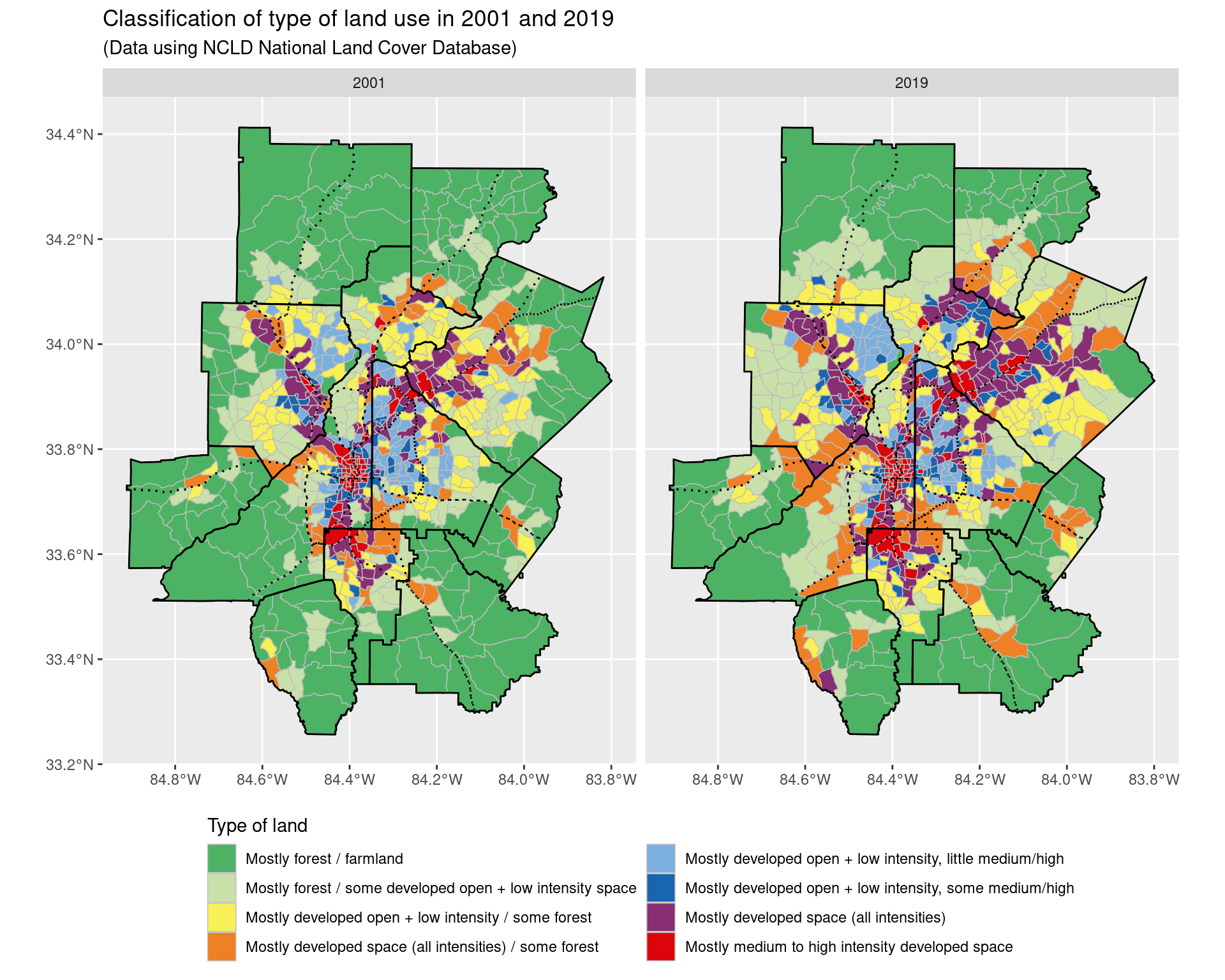
ggsave("img-files/land_use_change_2001_2019_clusters.pdf")6 Appendix
6.1 Data sources
- The American Communities Survey
- We highlight that the ACS only provides one-year estimates for geographical units with more than 70,000 residents, which means it is suitable for looking at counties, but not census tracts. As a result, we look at ACS 5-year estimates from non-overlapping time periods when looking at census tracts. Moreover, due to changes in the number and shapes of census tracts after different decennial census periods, we restrict our analysis to end points between 2010 and 2019 when examining census tracts. We also highlight that 1-year estimates for the year 2020 do not exist, as a result of the coronavirus pandemic.
- The ACS typically reports margin of errors, which correspond to 1.645 times the standard error; when performing hypotheis testing we will make this adjustment from the margin of error values.
- Adjustments between dollar values are done according to the Consumer Price Index; for example, the income adjustment factor between 2010 and 2020 is 1.19, and 1.175 for 2010 and 2019.
- National Land Cover Database
- Landsat satellite imagery
6.2 Testing for correlations of noisy observations
Suppose we make noisy observations \(((X_i, Y_i))_{i =1, \ldots, N}\) of some underlying quantities \(( (\mu_{X, i}, \mu_{Y, i}) )_{i = 1, \ldots, N}\) with known measurement standard errors \(\sigma_{X, i}\) and \(\sigma_{Y, i}\) respectively, and that the observations are made independently of each other. This is an assumption which is usually satisified by ACS data, where we make observations of multiple variables across different census tracts, with the noise arising from sampling uncertainity in not being able to survey all households. Here, \(i\) acts as the index for census tracts, and \(\mu_{X, i}\) and \(\mu_{Y, i}\) represent some underlying variables (e.g median income and the Gini index in a census tract) which we are interested in).
In such a scenario, it is typical to assume that conditional on the \(\mu_{X, i}\) and \(\mu_{Y, i}\) we have that \[ \begin{pmatrix} X_i \\ Y_i \end{pmatrix} \sim N\Big( \begin{pmatrix}
\mu_{X, i} \\ \mu_{Y, i} \end{pmatrix}, \begin{pmatrix} \sigma_{X, i}^2 & 0
\\ 0 & \sigma_{Y, i}^2 \end{pmatrix} \Big). \] Making the additional assumption that \[ \begin{pmatrix} \mu_{X, i} \\ \mu_{Y, i} \end{pmatrix} \sim
N\Big( \begin{pmatrix} \mu_{X} \\ \mu_{Y} \end{pmatrix}, \begin{pmatrix} \tau_X^2 & \rho \tau_X \tau_Y \\ \rho \tau_X \tau_Y & \tau_Y^2 \end{pmatrix} \Big)
\] independently across the units \(i\), then we are interested in making inference about \(\rho\). To do so, we make use of the fact that under the above assumptions, the marginal distribution of the \((X_i, Y_i)\) is \[ \begin{pmatrix} X_i \\ Y_i \end{pmatrix} \sim
N\Big( \begin{pmatrix} \mu_{X} \\ \mu_{Y} \end{pmatrix}, \begin{pmatrix}
\sigma_{X, i}^2 + \tau_X^2 & \rho \tau_X \tau_Y \\ \rho \tau_X \tau_Y & \sigma_{Y, i}^2 + \tau_Y^2
\end{pmatrix} \Big).
\] As a result, under the assumption that \(N^{-2} \sum_{i=1}^N (\sigma_{X, i}^4 + \sigma_{Y, i}^4) \to 0\) as \(N \to \infty\), a consistent estimator for \(\rho\) is given by \[\frac{ N^{-1} \sum_{i=1}^N (X_i - \bar{X})(Y_i - \bar{Y}) }{ \big( N^{-1} \sum_{i=1}^N [ (X_i - \bar{X})^2 - \sigma_{X, i}^2 ] \big)^{1/2} \big( N^{-1} \sum_{i=1}^N [ (Y_i - \bar{Y})^2 - \sigma_{Y, i}^2 ] \big)^{1/2} }\] where we write \(\bar{X} = N^{-1} \sum_{i=1}^N X_i\) and \(\bar{Y} = N^{-1} \sum_{i=1}^N Y_i\). In order to perform hypothesis testing, a bootstrap of the observed data \((X_i, Y_i, \sigma_{X, i}, \sigma_{Y, i})\) is used to approximate the sampling distribution of \(\rho\). We note that in finite samples, one of the square root terms may be negative; in such a scenario, we return the value of \(\rho\) as a NA; if this occurs frequently enough, then we will just consider the data too noisy to make reasonable inference for the presence of a correlation.
6.3 Standard errors of log ratios of quantities
Suppose we have observations \(X\) and \(Y\) whose expected values are \(\mu_X\) and \(\mu_Y\), and whose standard errors are \(\sigma_X\) and \(\sigma_Y\) respectively, and moreover suppose that \(X\) and \(Y\) are independent. In such a scenario, the estimate of \(\log(X/Y)\) is approximated by \(\log( \mu_X / \mu_Y )\) and the standard error is approximated by \[ \Big( \frac{ \sigma_X^2}{ \mu_X^2} + \frac{ \sigma_Y^2}{\mu_Y^2} \Big)^{1/2}.\] Looking at the ratio of quantities is suitable when we are interesting in looking at quantities which may be on different scales naturally, such as e.g the number of households in an census tract in different income bands, where census tracts may vary significantly in the number of households, but we expect the overall ratios between quantities to be similar.